Blog archive January 2024
<< November 2023 / February 2024 >>
28.01.24 / 01 / lightweight structures
Digging through old slides from my student days, I found this one.
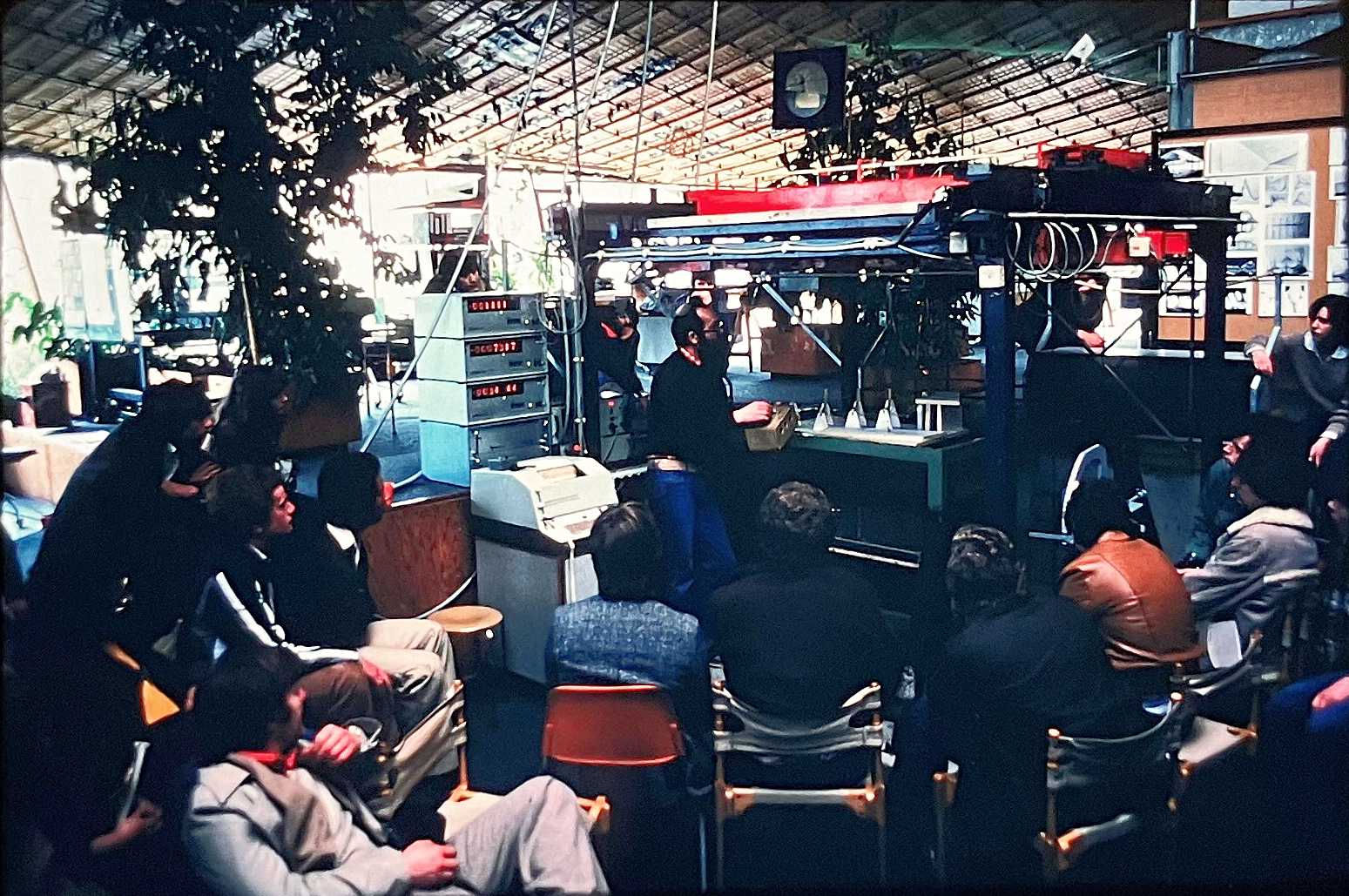
We were architecture and engineering students from the University of Bath. The School of Architecture and Building Engineering was effectively run at the time by radical engineering firm Buro Happold, who were collaborating with Frei Otto and the Institute of Lightweight Structures (IL) at the University of Stuttgart. So when we went on a trip to southern Germany in 1979, the key visits were to IL and the Munich Olympic Park.
Here we are at IL watching a demonstration of surface modelling. In those days it was necessary to use physical modelling techniques to create and analyse membrane structures. The rig is probably scanning a model into a computer for structural analysis. I can't see what the model is made of - which means it could well be a soap film. Given a set of supports and edges, a soap film will create a minimum surface between them in pure tension.
Later on we did similar things at Bath University, but the models were usually made from women's tights, which are also pure tension surfaces. The computer (there was only one) was looked at askance by some of the older tutors, as leading the students astray. One architecture student who laboured to create his degree project in the computer was failed, in part for the wireframe print-out drawings. He went to America for no doubt a brilliant career.
I've always been grateful to have been taught by Buro Happold. At the time I don't think I realised what I was being given. I worked for them for a month one summer as an intern, but I learned so much just by being in the room. I modelled structural options for the Hong Kong Cultural Centre roof, which is a cable net, and did perspectives of the foyer. A casual question led to a dissertation analysing the Georgian houses of Bath as models for a climate-controlled city in the Arctic.
In general, I learned seat-of-the-pants structural engineering - how minimal can it be, and not to be afraid of deflection (it's just becoming a more natural shape for the forces in it).
25.01.24 / 01 / more old website designs
So the update of the Grace website was a good moment to put shots of the 2015 version in the Grafix section here. It was my first responsive design, and I assumed that it would contain only text and single images, hence the narrow format. Also a preliminary version with solid-colour pages - I've always wanted to do that but never found the right place. Coloured pages are great in books or magazines, even bright saturated colours, but on screen the colour is illuminated so becomes wearing. Red paper and a red screen are different experiences.
Old iterations of alternativeworship.org and smallfire.org also added. alternativeworship.org was highly consistent over the years, and I wouldn't change the look and feel much now from the final version. The fact that I was actually paid to develop it - by Dawn Ministries in a hook-up arranged by Andrew Jones - made a real difference to the quality of the result, a lesson I haven't forgotten.
Whereas smallfire.org started in 2000 as a ludicrously garish essay in 1970s Jubilee Line station colours - brown, orange, royal blue, lime green, yellow - and a horizontal scrolling format taken from Evan Hecox's first site, quite a novelty at the time. The menus and buttons were all built in Flash, put together in frames, so all that remains of the early versions is unplayable pieces. Probably just as well. Hecox's site is also lost. The horizontally scrolling photos still continue in all my sites. To me it's the best way to read them, like a comic strip.
The later iterations of smallfire.org had learned something about quality and consistency from alternativeworship.org - the yellow/red/grey colours still run through. I brought back the tealight 'flame' from 2000 for the current site logo, though it doesn't 'twinkle' like the Flash version!
11.01.24 / 01 / keeping the suspended ceiling
In the 00s businesses wanted to look global and corporate. They were escaping from 80s or even 70s offices full of dark veneers and heavy colours. They wanted a neutral, dematerialised look - white, silver, grey, glass, gloss - to express their new dematerialised technological world. And they wanted it to look the same everywhere on the planet. Ten years later they were saying, rip it out! Fill it with hipster junk! Make it look like an old warehouse!
The warehouse aesthetic arose naturally from being a startup in an old industrial building in a poor part of town without much money to do up the surroundings. That accidental aesthetic became a shorthand for organisational and technological change, and a shortcut to behavioural change - let’s all make like a software startup.
Which is OK if you are in a 19th century industrial building, but crazy if you are in a 21st century skyscraper. The surroundings you have inherited are white metal ceilings with luminaires and grilles, drywall partitions, flush glazed office fronts, carpeted raised access floors.
So we spent the last ten years ripping out perfectly good suspended ceilings to create the fashionable exposed services look, and sticking fibreglass fake brickwork onto drywall partitions. It’s not honest and it’s not sustainable. For me, the next frontier is, how do we achieve the cultural and behavioural changes, within the glossy 00s fitout? What exactly do we need to change?
The metal suspended ceiling is perhaps the central issue. It does a lot of good things. It has a major role in modulating the acoustics of the space. It carries all the necessary services - lighting, grilles, fire alarms, sensors, etc. It hides functional but unpretty ducts and wires. But it also imposes a technical and uniform feel - the antithesis of domestic. Can we accept that we are in a modern office, and not in a home, a hotel or a warehouse? Colour change seems like an idea, but it’s vulnerable to fashion (which raises a secondary issue, of how fast fashion should change, and what should remain outside of fashion). Personally, I find black and bronze have continued to look good as ceiling colours over a very long time. What else? Grey requires caution - light grey can look like white, badly lit.
Colours and finishes: Twenty years ago it was a point of pride to be consistent, even uniform. Death by brand standards. Now every room is different to the next and the finishes schedule runs to 100 items. This too is ripe for change. I’ve been wanting to calm things down for six or seven years at least.
Key words:
- Calm
- Adult
- Hospitable
- Warm
- Professional (What is that? A kind of self discipline?)
- Inclusive
- Classic? The 00s thing aspired to neutrality and longevity - it was often very high quality - but classic went out of fashion. Sustainability means honouring that intention.
Our culture loves visible change. It shows we’re alive and growing. So we change things just to make a point. It has to become a point of pride not to change certain things - to stay the same, to keep things for the long term.
10.01.24 / 01 / archivist
When I go to pioneer mission events or similar I never know how to describe myself in that context, in order to explain what I’m doing there. I ask Jonny what I should say, I want him to define me, but he doesn’t.
Sometimes I am called an archivist, but I have a discomfort with that. It implies a purely historical role, packing stuff safely away to be forgotten and rediscovered centuries hence*. When I called smallfire.org an archive I didn’t know that I was branding myself! It was an odd choice of word at the time but I couldn’t think of another way of describing it.
And now I look after the Grace web archive. But if it were just an archive it could simply be a collection of files and folders on a drive or download somewhere, for Grace’s internal use. I’m a preserver of things that I think have artistic or historical merit, but also by instinct a publicist and a polemicist. The Grace archive is a publication (and the same is true of smallfire.org) to the world at large - look what we did, you can use it or be inspired by it, you can do it too - it’s intended to generate action in the near future. There isn’t a lot of difference between the Grace archive and a blog, really - i just need to make more of it on the front page newsfeed.
My motivations are always from architecture and punk - publish what you think and do to pursue a line of argument in public, to generate change. The archive is missional and provocative.
It’s also a classic ‘donut’ situation - all this amazing stuff for global consumption, from a small bunch of people who can hardly keep it together.
* Sue Donnelly who is a professional archivist is upset at my characterisation of the archive, but for me this is the conventional image. tp bennett had an archive and an archivist for business reasons, but the experience was one of disappearance, projects vanishing into boxes or backup tapes stored remotely, with no interface and difficult to access. It used to take several days to get an archived project back, on one occasion several weeks when the software to read the tape malfunctioned. When I left in 2021 the recent archive was about to become instant-access, but for a century-old firm much would never be reformatted.
09.01.24 / 01 / grace site update
For several years now I’ve had a Grace photos site on my to-do list. Yes there’s stuff on Flickr and smallfire.org, but I have more material than can sensibly be put in those places.
The 30th birthday service in November generated a stream of Whatsapp photos that had to be integrated into the archive page. In doing so I realised I had the solution for the rest - add the photos to the bottom of the archive service pages. This gives a place for the less good photos, the minor services, the ones that aren’t the hero images chosen for publicity but are still a record of an event.
So far I’ve done the exercise up to the end of 2005 - only another 18 years of services to go! smallfire.org is a massive help here - photos and html already formatted. To incorporate the photos I’ve given the Grace website its first major reformat since 2015. It was my first responsive design so I’ve developed better ways of doing things since then. I need to update and maybe rethink the menu system, never a fun task since it means changing every single page. This is also about bringing material in off other platforms, videos also. Flickr, Vimeo etc were a great solution in the late 00s but now hosting comes with huge storage and HTML5 handles self-hosted videos well at last.
Before the Drupal website of 2006, we had no archive as such. Some material from earlier events was added after 2006 but it was understandably patchy. While adding photos I’ve disinterred quite a bit of missing material from old emails, and even bits of 1990s paper - several entire services have been found. Sometimes there are photos but little or no material to explain them - maybe they will jog some memories. Putting the photos together with the archive material allows for a fuller reconstruction of what happened.
The photos begin in May 1998 when I started to take them - if anyone took some earlier I don’t have them. There is a marked increase in the number of photos from November 2003 when I switched from film to digital. This exercise shows up what I didn’t photograph - in the days of film I was being economical - which of course I now regret (not sufficiently heeding the Larry Clark advice, “Photograph everything... Time goes by quicker than you think, take the pictures now.”). Even with digital I sometimes didn’t bother - I was looking for striking images to publish rather than a mere record of what might be a visually low-key service. The new archive format removes that concern - just snap away for the record. Sometimes good-looking services didn’t result in good photos - I didn’t have the right frame of mind, couldn’t find the shots.
I’ve also added the flyers to the earlier service pages. From 2005 there were digital flyers for individual events, but before that there were generally just the quarterly or annual printed flyers. They were nice so it’s good to have a place for them. Sometimes they're the only image or source of information! The last printed one was for 2009-10, by which point we’d discovered Moo cards.