Blog
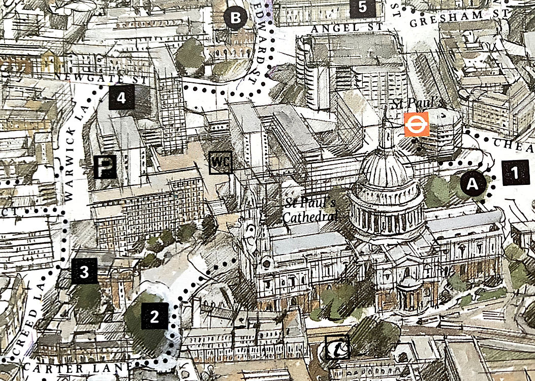
27.04.26 / 01 / paternoster square
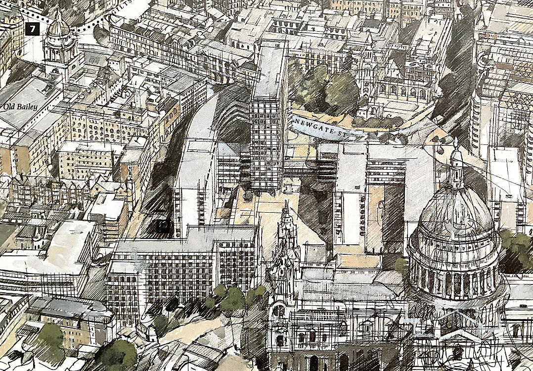
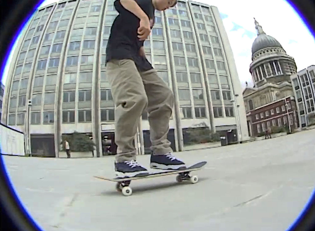
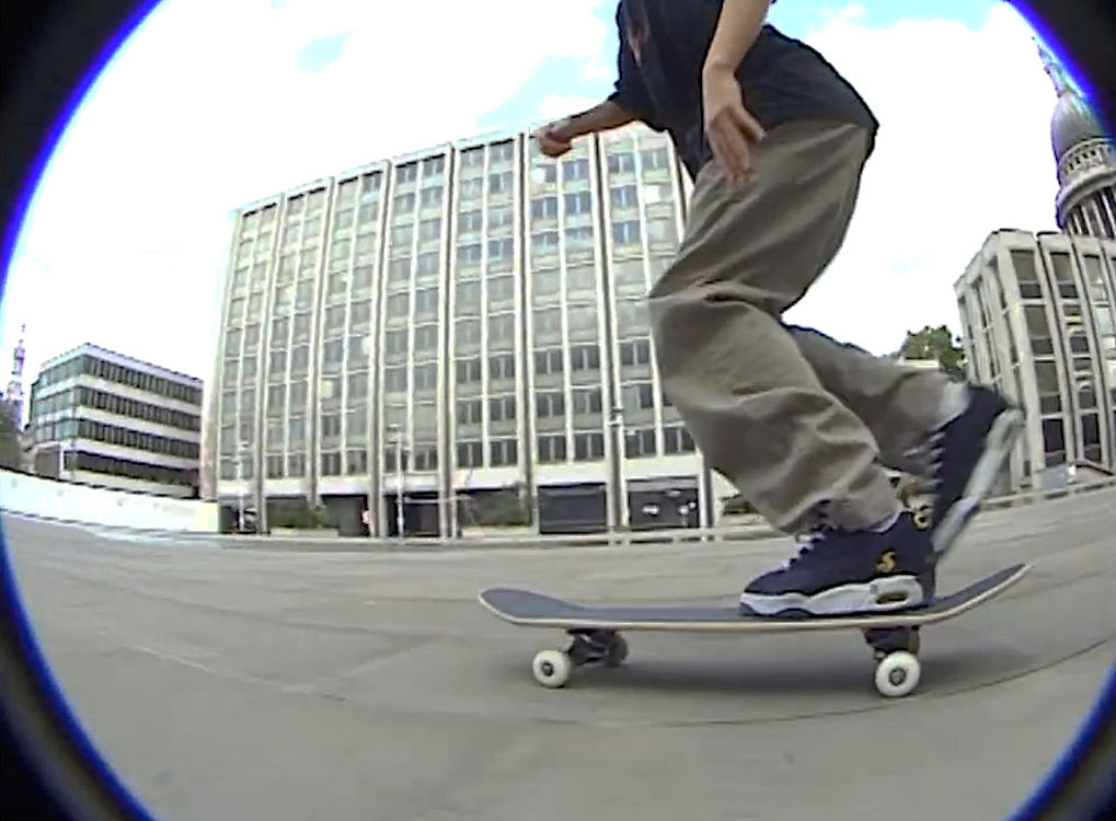
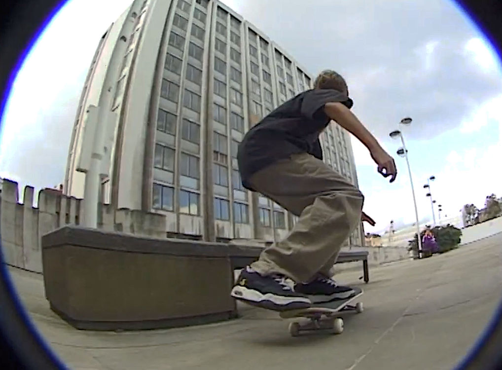
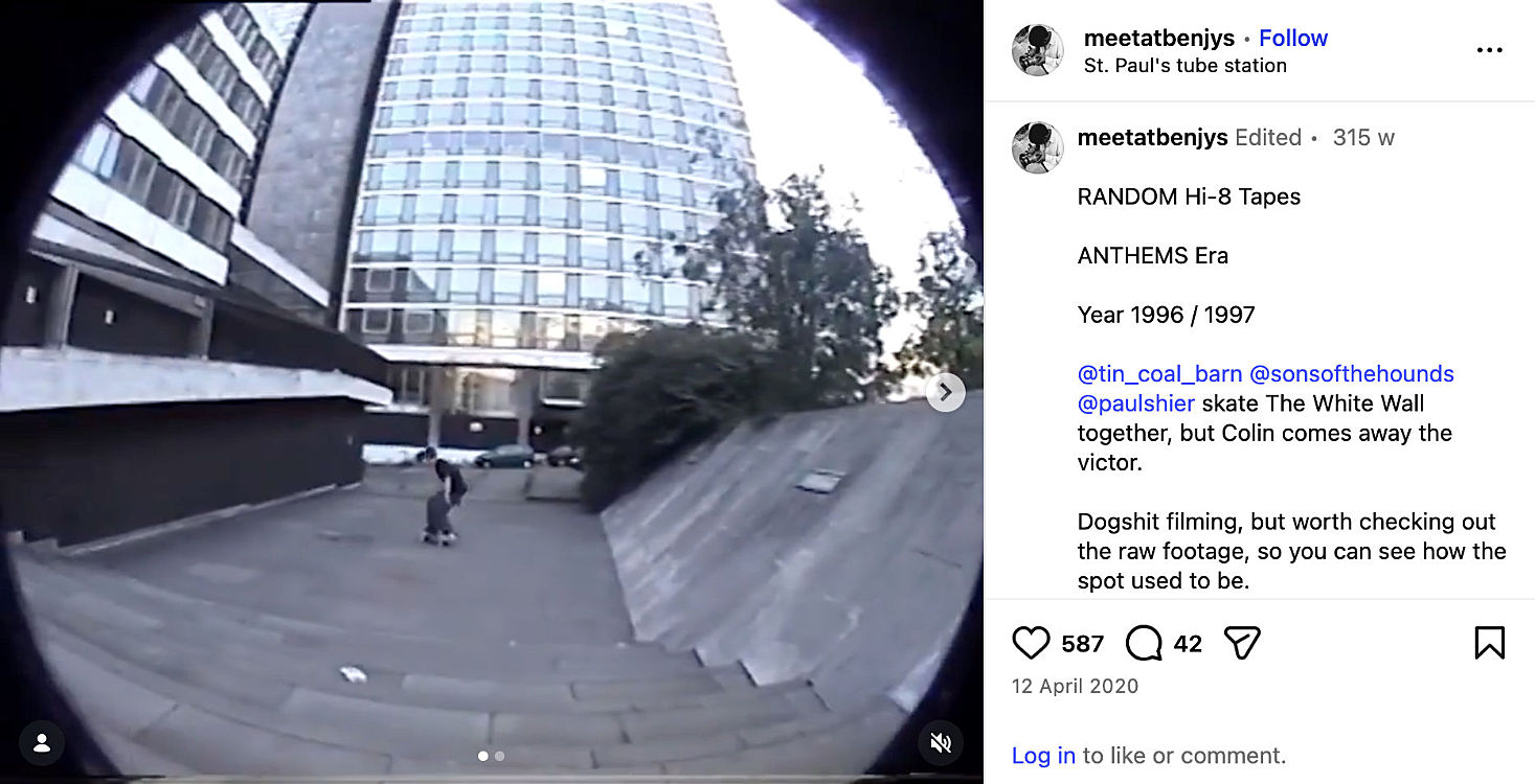
When digging through late 20th century photos of London, I’m always looking out for shots of Paternoster Square, next to St Pauls Cathedral. Not the current version, but the 1960s development demolished around 2000. I used to walk through it quite often for some reason, and it was a famous skate spot due to its expanses of paving and shallow steps. My skateboard wheels had St Pauls Cathedral on for that reason.
However, it’s quite hard to find any photos - it was so dull that photographers of all kinds systematically excluded it from their shots. It’s always sliding out of frame, and never the subject. I was surprised to find it well illustrated in an old book, but the illustrations make it look too interesting. About the only place to see it is in 1990s skateboarding movies! [first one is all at Paternoster, second one from 1:43 to 2:43]
In 1951 there was a silly spat in the pages of the Architectural Review. Charles Holden (in his town planner role) was advocating Classical redevelopment around St Pauls. The editor of the AR got on his very high modernist horse and severely criticised Holden, who made a patient but hurt reply, and was slapped down again as a reactionary. Reading the exchange now one feels that Holden deserved more respect. Especially as the doctrinaire modernist solution failed so badly. In fact neither man got what they wanted.
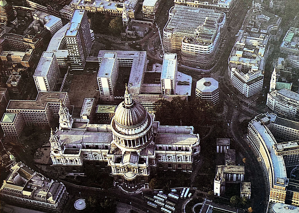
To the east of St Pauls, New Change was rebuilt in a busy but exhausted Neo-Georgian style, proof that the idiom had run out of road. It lacked the dull virtues of the style, which would at least have provided a dignified backdrop for the cathedral. If there is such a thing as passive-aggressive architecture, this was it. It sterilised a large part of the neighbourhood for 50 years.
To the north, the site of Paternoster Square was rebuilt as a doctrinaire Modernist precinct, pedestrian decks above car parking, between stumpy slab blocks. It was a piece of the ‘pedway’ system of first-floor pedestrian routes, but it didn’t join up with anywhere. A facade design of polite monotony was repeated like wallpaper across almost all of the blocks. It lacked the disrespectful virtues of brutalism that would have made it iconic, eventually. A slice of the Barbican, or the Southbank Centre, would have been better next to St Pauls regardless of initial outrage.
Ironically the care taken around St Pauls resulted in bad urban design. Compromised, second-guessed. The classical and the modernist developments were both too big, too monotonous, architecturally debased.
In the 2000s both sites were rebuilt as their opposite. Modernist Paternoster Square was rebuilt in an abstract classical style with streets and an actual square. Classical New Change was rebuilt as a Deconstructivist glass box sliced open by public routes. Both work. Both are far better than the preceding schemes.
In the end it wasn’t about style. It was about urbanism - permeability, walkability, scale. It was about architectural quality. Great buildings next to great buildings always works.
26.02.26 / 01 / vimeo deletion
I just deleted my Vimeo account. I meant to do it last year but the subs auto-renewed while I was distracted by my mother's final illness.
Back in 2008 Vimeo was the best solution for remote storage and showing your videos to the world. Youtube still had various limitations that I bumped against. Vimeo looked more professional, no ads, nice controls and reliable embed on your sites. But of course it changed direction towards a higher-priced business-oriented platform. I continued through on a legacy package but I really wasn't using it intensively or ambitiously enough. And nowadays hosting comes with huge amounts of storage, the HTML5 video tag handles everything sweetly, and even a phone can handle pages with several vids in. So I moved them into my sites - did smallfire.org and Grace a while back, just fixed my blog now. Also upgraded some early videos and added a few that were only on Vimeo, or even not published at all.
Now I have the tedious task of removing Vimeo from the site menu. Every page.
17.01.26 / 01 / christmas decorations
Tonight I put away the Christmas decorations for the last time in my parents’ house. I feel sad.
My mother didn’t bother with decorations or tree after the pandemic, due to age and dementia, though I insisted on putting a few things out to make it feel like Christmas. I found the old plastic tree in the attic during the summer - it must have been up there 25 years or so, my parents took to having real trees.
So having found a tree, and the baubles in my mother’s wardrobe, I put it up in December for one last time. It was the first time I had decorated a tree myself, there has always been someone to do it for me! I never had one myself because I am never at home for Christmas.
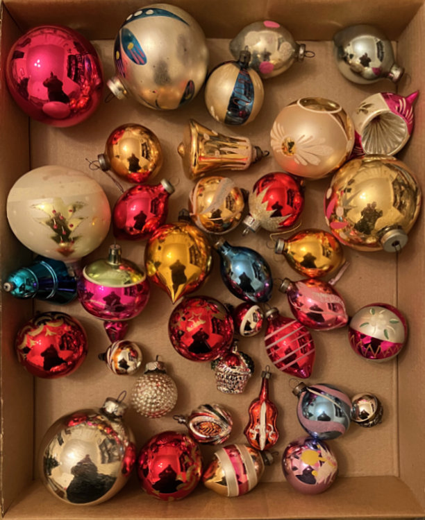
Half of the baubles date from around the time I was born - I have no memory of a time without them. And there are various things added during my earlier childhood, and then when my brothers were children in the 70s. After that it’s just odd gifts or things my parents fancied.
They never went in for fashions in decoration. The original c.1960 set were fashionable then, which makes them wonderful now, but my parents believed that decorations carry family memories and stories that develop over time, and are remembered each year as we look at the tree.
When we were children my father used to festoon the ceilings with paper decorations - brightly coloured tissue that concertinaed out to form bells and spheres and rows of figures. Of course we also spent hours making paper chains. I found some more recent shiny foil versions, but it was too much effort to put them up and the pinholes have vanished (one was only allowed to pin in the same place each year).
And now it’s all packed away, and the next time will be in another house.
Below, the 1960s glass baubles. The golden bell rings.
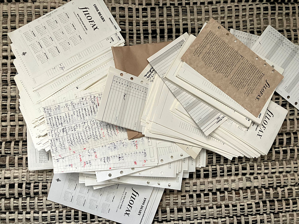
04.01.26 / 01 / filofax as blog
Before I threw out the Filofax diary inserts I went through them making notes of significant items. The notes looked like blog entries, so I turned them into an extension of my blog archives back to 1988. Click the blog archive link above to see.
There isn't enough material to do the usual monthly archive pages, so it's a page per year. I haven't included all of my notes, some things are too trivial or personal or have no story to tell. Conversely I've added things that weren't in the Filofax but are too important or interesting to leave out now that I've made the pages.
It's very clear that my life changed dramatically from 1996 onward, as I got involved in alternative worship. 1998-2002 is a whirlwind - I was simultaneously in several churches, several discussion boards, writing columns, making or editing websites, creating parts of events, photographing and publishing them, designing flyers and publicity and so on. It was possible because I only needed to work intermittently for a while. By late 2002 I had to get a full-time job in architecture again to repair my finances, so some of this stuff had to stop or happen more slowly, but then I started a blog.
I have diaries from before the Filofax, but they don't contain much information (and I have no desire to revisit the periods). There was something about a Filofax which encouraged a thicker narrative, perhaps because I lived out of it in an active way, it was always open on the desk being written in.
It's hard to remember how analogue life was in 1988. To publish a blog would mean typing it out (a word processor at best) and faxing it, or posting photocopies. I suppose that's what a zine was.
06.12.25 / 01 / family tree 2
I was surprised when various friends said they had no interest in their family trees. I know some people are obsessive about it, but if I were a Maori, an African, a Jew or a member of the Sicilian Mafia nobody would be surprised that I was researching my kinship network.
Modern Western society encourages us to see ourselves as individuals, without significant ties to kin or tradition or place. This brings many benefits in terms of self-actualisation, as well as oiling the wheels of capitalism and consumerism. The cost is alienation. Our psychology developed in tribes - the business of Dunbar’s number/the monkeysphere is about tracking relationships in a kinship group. Having broken free from family we recreate it as ‘chosen family’. Who and how we are in the world is always relational.
[Maybe Dunbar's number is why I baulk at researching the other ten siblings on every 19th century family tree branch. There's a point at which you want to limit the number of people in your 'relational family' to ones you can care about!]
So in researching my family tree I am renarrating myself. There is no scientific mechanism that I know of to make me want to do what my forebears have done - though I can imagine a cultural imperative. But this is to say that we construct a personal narrative that includes our family. Nowadays that is taken to mean only our immediate family, but to research one’s wider and deeper family opens one up to the possibility of them affecting one’s narrative too. It’s hard to learn that one comes from a long line of fishermen and sailors without wondering whether one should also have been one. We are encouraged to see it as a purely personal decision, but it feels strange that a chain has been broken (of course there are chains that need to be broken, but we are looking at honourable occupations). My nieces are good sailors, they just need to start catching fish :)
05.12.25 / 01 / family tree
Meanwhile I have been researching my family tree on Ancestry since late 2024. This had been coming for a long while, for a number of reasons. My brother had received a box of old family certificates going back into the 19th century, on our father’s side. My mother had told me all kinds of things over the years that I had surreptitiously written down and tried to make sense of in a self-created tree. She came from a broken home, she lost contact with her father and his family, and then with her mother’s family as well, so there was a mystery. We had a few photos, a couple of names, a few stories. My brother set up on Ancestry and joined me in. When my mother died and I came into possession of the family photos and other old documents, it gave new impetus.
It’s an extraordinary rabbit hole. It involves databases and archives connecting out there and feeding you stuff. You sift evidence in the light of stories or knowledge that you have. It feels like detective work in a story. Startling revelations arrive at 2:30am when you are about to go to bed. If you find the right thread to pull, a person’s life history can come tumbling out of nowhere in detail - otherwise there’s nothing. Military records tell you a lot - in illegible Edwardian handwriting. Old family hearsay is proved true, but there are hidden surprises and scandals.
On my father’s side I come from a long line of sailors and fishermen. We followed the fishing trade from Barking in the 19th century, to Great Yarmouth, to Grimsby. My mother’s side were itinerant farm labourers in the fens of Lincolnshire - constantly moving from farm to farm in the same 10-mile radius in what must have been a hard existence.
Back in the 19th century everyone had 6 or 10 siblings, which is daunting - too much new family! But some are very interesting. One sets up boundaries - do we have photos, or stories, or artefacts? Some people are ‘the family’, others are visitors who married in - it’s a subjective thing, where the main stream is. It depends on where you are in the tree.
The people I would most like to meet are two of my great-grandfathers, one on each side. Both feel like key characters in our family. Both led interesting but very different lives. My father’s grandfather was a sailor. His ship was in Hamburg when WW1 broke out, and he spent the war in a famous POW camp - we have the postcards. After the war he retired from the sea and operated the dock gates in Grimsby. My mother’s grandfather was in the Royal Field Artillery in the Boer War, then joined up again in 1914. He fought in Belgium in 1915, then in the Balkans in 1916 before being invalided out in early 1918. He separated from his wife and children early in the war, and by the time my mother knew him in the 1940s he was living with a woman who was not his wife - but he was a Roman Catholic and perhaps couldn’t get a divorce.
Another surprise was one of my father’s great-uncles. He was a fisherman, but also a Naval Reserve. In 1915 his boat vanished without trace. No-one knows what happened, but the crew are listed on the big war memorial next to the Tower of London which commemorates those who died at sea in both wars and who have no grave. Fishing is always risky and was riskier in the war, but fishing boats were also used for covert spying on German shipping movements, which may explain the memorial and the medals to his widow. We have his Bible.
03.12.25 / 01 / filofax
See, this is how a rabbit hole happens.
I wanted to fix the velcro on my umbrella (the bit that wraps round and holds it closed). I got the sewing box out and found that the cotton had mould on - an old leather cord had gone mouldy. So I got the rest of the things out of the drawer to check them, including all the Filofax diary inserts that I had kept right back to the 80s. I had been thinking about getting rid of them anyway, but of course I had to go through them to check. Keeping them wasn’t just sentimentality - it was essential pre-digital record keeping. Periodically one would need to give precise dates of employment or residence for something.
It wasn’t just an 80s fad, although a matt black Filofax in a Chevignon backpack made me ‘one of the 11 trendy people this week’ (The Face) in 1988. It was the analogue equivalent of a smartphone, with paper apps.
I got a Filofax in late 1987 after a change of job, to record my work diary, timesheet hours, contacts etc in a compact and professional way. One was given ‘work diaries’ but they were always ugly and random formats. One thing you could do with a Filofax was keep half of the previous year’s diary in alongside the coming year, so you could refer back. There were lots of tempting multicoloured inserts for all kinds of things, I bought a few but didn’t much need them - it was always about the diary.
I always recorded the truth about my work hours and what I was doing in my own diary - and then chose what to record officially. Some employers didn’t allow you to record overtime, but I always kept a record of actual hours. I think it’s disgraceful and stupid not to know what your workforce are actually doing, regardless of whether you pay them for it or not. You need to know who’s under pressure, or struggling, or slacking, which projects need resources and so on. Until the late 2010s, working hours recorded on weekends meant I had travelled into the office. It’s sad to see how often that happened.
Eventually digital record-keeping and calendars took over, but it took a while for them to be reliable and to sync properly between devices and software formats (and one’s work calendar isn’t portable between employers). Until then the Filofax was a stable personal record. I started to use Apple Calendar at the beginning of 2013 - it is empty before - and I stopped using the Filofax.
The problem by then was that the information didn’t sync. This wasn’t an issue when nothing synced, but it became an issue when other things did. Digital things shift about because there’s little cost to doing so. It became tiresome to cross out and rewrite meetings that kept changing time and venue right up to the last minute. And phone numbers in a Filofax can’t be called by touching them.
My first binder was a 1987 ‘Wellington’ in ribbed black rubber. I have haptic memories of the magnetic clasp and rubber ribs when I look at pictures. The chunky thingness of it was pleasing, I wish I'd kept it. In 1999 I got the Personal Active model, also rubberized, which zipped up to stop the inserts getting dirty in my bag - but it was a big beast. I downsized in about 2010 to a small one to save space and weight.
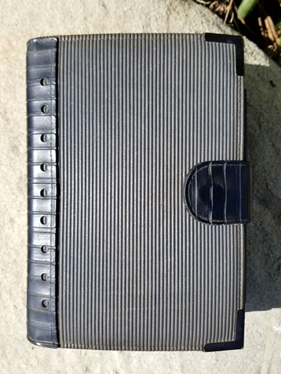
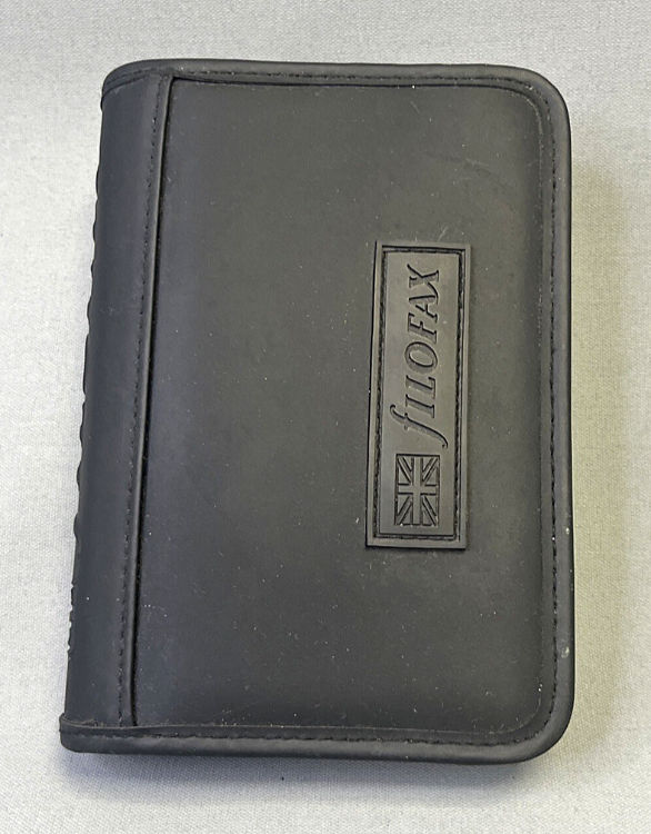
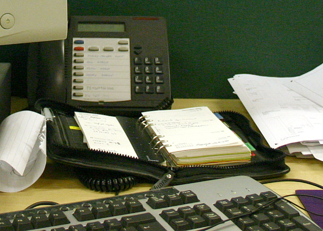
Above, some of my old inserts, 1987 Wellington, 1999 Personal Active (not my photos), my untidy desk 2003.
The place of the Filofax in my bag was taken by a moleskine for notes and sketches. It’s more compact and stays bound in its cover when you’ve finished with it. It’s strange that I never used the Filofax for that kind of thing, I always meant to.
06.11.25 / 01 / collecting
Back in the summer I went through the contents of my mother’s house, to see what there was in cupboards and the attic, to make an inventory and value it for estate purposes. I threw out the junk to clear the ground, but otherwise I didn’t rearrange anything.
Now I am going through it all again, making collections with an eye to give or take away. Things that were scattered are now brought together.
My father’s life is in a large tin. It already was, my mother put it there, but I have added. Boys Brigade badges, cards, certificates, school reports, his drawing instruments, a cigarette case, and so on. My mother’s life is in a box, and a tin, and a bag right now. She kept so many cards - her 21st birthday, wedding, first anniversary - beautiful 1950s cards, bright pinks and baby blues, kitsch, but more delicate and coherent than nowadays. Add in the Golden Wedding cards, the Valentine cards from my father, the sympathy cards when he died. And so on. My mother’s diaries, 30 years or so, are in a drawer, to be gone through sometime. These are things that can’t be thrown out, but they need custodians. Not owners, because they belong to the family and will be passed on. Maybe one day some of these things will go, when they have lost their significance, but not yet.
There are specific legacies to be given, but we need to think about keepsakes for other family members. For me and my brothers, many things come to us naturally. Stuff about us that our parents kept, reports and certificates and photos. Childhood cards we gave that they kept, which now return to us.
I have a list of the furniture - the things we will keep, if we can make space, and the rest. And the many domestic items that are not exactly personal, but are significant or interesting. Part of the home or of our lives. I have to restrain my magpie tendencies and let others have their choice!
It’s emotionally arduous work. It’s a process of dismantling. Drawers are empty, gaps appear on shelves. The fabric of a home begins to dissolve. It’s probably always hard, but this house has been the family home for almost 60 years. It’s not just the last place our parents lived.
06.10.25 / 01 / jeff hawke
I’ve had a couple of images from Jeff Hawke floating around my mind since the early 70s. One is of a scary woman called Lilith. The other is Hawke and a companion driving into a future London - it would be great to see that now for comparison. I did find Lilith, but not yet the London picture.
Jeff Hawke was a daily comic strip by Sydney Jordan that ran in the Daily Express from 1954 to 1974. In the early years it was drawn and mostly written by Jordan, and was a standard space action series, set in a 1980s and 90s that looked like the 50s but with '2001'-style aerospace technology - moonbase, space station, supersonic airliners etc. Jordan had studied aerospace engineering so the strip showed actual advanced projects that didn't make it in real life.
In 1960 Jordan’s dialogue writer Willie Patterson took over the plots and storylines as well, and the strip took a highly imaginative turn, featuring weird and very various aliens who bickered and schemed and dragged Hawke and friends into bizarre or perilous situations that had nothing to do with the usual invasion-of-Earth stuff. Patterson retired in 1969 and the strip was never as humorous and clever again. By then the aliens were often scantily clad women and the strip took an erotic turn with much partial nudity. In 1974 the newspaper suddenly cancelled it (not because of the nudity as far as I know).
Jordan began a new strip in 1976 called Lance McLane, set in the late 21st century. This ran in a Scottish paper until 1988, but to sell it for syndication Jeff Hawke was 'transmitted' into the body of McLane and the strip continued in two versions as Jeff Hawke and Lance McLane. There was no continuity with the original strip, Hawke didn’t even look the same. The artwork and writing were often done by others with variable results.
Jeff Hawke was popular in Europe (quite a lot of strips on this site, but in Italian! Go to the bottom for the links.) You can buy the full run in Italian, but the English language republication has been limited. There are a couple of anthologies of 60s stories by Titan Books, and the Jeff Hawke Club published the whole lot in a limited edition 2003-2018 but appears to be defunct. The early-00s version of their website is fun though.
I was too young for the best years of Hawke, and since I didn’t read the newspaper daily I couldn’t follow it anyway - there were some striking images, but in truth it was too sophisticated for me then.
05.10.25 / 01 / postmodern or post-modern?
I don't quite know whether to hyphenate or not. Jencks always hyphenated, to emphasise that it was a work in progress, moving away from modernism but not yet definable as a single new thing. To me, the hyphenated form suggests the early stages in the 60s and 70s, experimental mutations of modernism in many directions, all sharing an impulse towards metaphor and communication. By 1981 this had converged almost everywhere to a form of classicism, which is what most people now think of as post[-]modernism. It feels more comfortable to drop the hyphen for postmodern classicism. There isn't any real consensus yet.
04.10.25 / 03 / postmodern colour
Postmodernism was the last architectural style to be developed entirely as hand drawing, making particular use of coloured pencils, crayons and pastels. The drawings were often saleable as art. So colour was an essential part, built into the design from the first sketches - the challenge was often how to realise the design colours in the actual buildings. Colour systems for architectural finishes took a while to catch up.
But colour is a vulnerable element in buildings. It weathers and fades, it goes out of fashion and is replaced. In the 80s people were reacting against the greys and browns of 1960s and 70s architecture - how drab, let’s have red and green in stripes and grids. And now people say, how overbearing and obtrusive, let’s replace it with black, grey and brown.
Modernism in the 1920s was often brightly coloured, inside and out, because it sat close to painting. But it was published in black and white photographs, giving the impression of a 'white architecture'. After WW2 much had been lost, and restorations tended to omit the colour, which had been forgotten or lacked evidence. Le Corbusier's Villa Savoye was restored as the epitome of the 'white architecture', but the curved walls on top had been blue and pink - like a Corbusier still-life. It still hasn't been recoloured. Corbusier continued to use strong colour in his buildings, but this wasn't much copied, while the raw concrete was.
High-tech and postmodernism brought the colour back, but it was controversial, because colour stands out from the context. The convention is to blend in. Architects play safe rather than have a scheme rejected because of the colours. How did John Outram get away with his outrageous schemes? Is it because they are so bold - an argument for being braver? Is it because the forms are historicist, and this disarms traditionalists who would oppose an equally brazen modernist building?
04.10.25 / 02 / the vanishing 80s
In the last couple of years I’ve been photographing 80s and early 90s office buildings in London, which are being pulled down en masse at the moment. Certainly they are tired and unfashionable, but the reason to demolish 40 year old buildings is because the land values will now support 40 storeys rather than 10.
Buildings usually can’t be listed for preservation before they are 30 years old, so many 80s buildings are vanishing or being radically altered before they can be reassessed for historical value. The demolition of much of Broadgate - an admired and coherent scheme that seemed surely destined for listing - made me pay attention. As usual this happens just as a period starts to be interesting again for designers, which is when it is at the nadir of value for the world in general.
Not all 80s buildings are postmodern, but postmodern styling is vulnerable to unsympathetic treatment. The Landmark House refurbishment is symptomatic - strip the obvious postmodern elements and paint the windowframes black for a fashionably neutral look. The refurbishment contractor's website talks of 'releasing its asset potential' which sums it up - owners and agents don't want architecture as such, they want maximised floorspace in a generically fashionable style that's easy to let to tenants who want whatever looks 'prestigious' at the moment.
Maybe 1980s buildings had too much architecture on too small a scale - a frequent fault of the period. 80s stuff was small by today's standards, but didn't know it. Everyone was over-reacting against 1960s monolithic modernism - hence complexity of form and elaboration of detail. I know, I did it! When I look at those facades I know how someone sweated over every pilaster and balustrade.
We wanted to revive the richness of ornament of pre-Modernist work, but there was seldom the budget to do it properly. Postmodern architecture was historicism done cheaply - the simplification, the cardboard-model effects. This could be witty in the hands of a knowing architect, or dull and debased otherwise. The style was meant to be a new beginning, but quickly got a bad reputation. Architects, and clients, returned to a more stylish modernism. The heritage challenge now is picking out the good postmodern work from the commercial rubbish.
04.10.25 / 01 / terry farrell
Postmodern architect Terry Farrell died at the end of last month. I had just photographed Landmark House in the City, which I hadn’t looked at before but remembered from a fuss about ten years ago. It had been subjected to a makeover that removed its postmodern entrances and red granite cladding stripes. Farrell and others protested - he considered it to be one of his best.
And then I visited the Comyn Ching triangle in Covent Garden - listed at the time of the Landmark House fuss to prevent similar damaging changes. Comyn Ching is a wonder - sensitive restoration of 18th/19th century buildings with bold but appropriate postmodern additions. The doorcases and ironwork are reminiscent of Mackintosh - a definite 1900 feel. Mackintosh was a big influence on British postmodernism in the years around 1980 - this was when he became an important figure again. His grids and abstract-classical mouldings were an accessible and affordable way to do ornament. We didn't attempt to imitate the complex Art Nouveau stuff!
I should go and look at some more of Farrell's work, before someone spoils it. I've tended to take it for granted. 125 London Wall aka Alban Gate is next on the list.
01.10.25 / 01 / blitz kids
More of my life as museum exhibit - the Blitz Kids at the Design Museum. That post-punk movement that started as Bowie nights run by Steve Strange and Rusty Egan for their select friends, hit the media in 1980 as ‘Blitz Kids’ and 'New Romantics’ and became the mainstream of early 80s British fashion and pop.
Strange and Egan innovated in British club culture - the club was no longer the venue, but the people and their music. The venue was anywhere that would have them - Strange and Egan would guarantee a crowd of customers on an off-peak night. The club moved around - the media caught up with it at Blitz, a 40s-themed venue in Covent Garden that had nothing to do with what went on - but there was never a fixed location or name. ‘New Romantic’ was a media headline that stuck for lack of anything else. The Face called it ‘the cult with no name’. This ‘portable club’ model became the new norm for the 80s and beyond, at the sharp end of clubbing.
The movement was entrepreneurial. People made their own clubs, fashion labels, shops, furniture, music, magazines etc and hyped them mutually - in the recession no-one else was going to help you. The fashion designers in particular suffered from lack of financial backing - it’s sad to see the quality of work that never made it big - it would be different later, in the days of McQueen and Galliano.
I never went to Blitz or its associated clubs - I was a student in Bath at the time. But we were doing similar things, and so were people in Sheffield, and other places around the country. It was the next logical step - after punk the rules of fashion were suspended for three or four years, you could wear anything, and people wanted to dress up. When we saw the Blitz Kids in the papers we said, “oh they’re doing it too”.
The Blitz Kids’ advantage was that they had real fashion designers among them who were making and wearing couture outfits to the club. The rest of us were restricted to creative salvage. In those days ‘thrift stores’ (a much later term) were not curated - full of the contents of dead people’s houses, and therefore much more interesting. Cool stuff from the 50s and 60s, but the body shapes were not the same as young students. Black and white tie evening dress was the thing for men - tuxedos and tailcoats, cummerbunds and waistcoats, you could get the whole thing with some shopping around. The issue was that this stuff had usually been made for short fat old men. Women went for ballgowns, or 50s-60s dresses and shoes, with similar size issues. The size issues did perhaps assist with the cross-dressing though.
Many of the key players at Blitz lived in squats in Fitzrovia. The photos are astounding - it’s hard to believe that parts of central London were that derelict less than 50 years ago. There is a little video of scenes from the late 70s which shows the shabbiness and drabness of London then. This is where creativity thrives - see also the state of New York at the time, and what it birthed.
Club for Heroes is now Club for Pensioners. Everyone who was there is now old - the exhibition was full of old people. I paid a ‘concession’ ticket price for the first time ever - I was bemused that nobody questioned it - I must be looking old today, I thought. The interview clips of Blitz Kids as they are now were barely recognisable - except for Marilyn, who looks the same but older in a Helen Mirren sort of way. Steve Strange sadly died ten years ago.
It was a period I went through, it was fun at the time, but it didn’t stay with me - whereas acid house ten years later did. I was wryly amused by the exhibition, but don’t want to relive the era.
26.09.25 / 01 / london design festival 2025
Notes from London Design Festival, culled from my Flickr feed:
Otl Aicher
There was a small exhibition of Otl Aicher's work. These posters show the development of the graphic system for the 1972 Munich Olympics - the first poster is from 1969, the second poster from 1971 shows the addition of yellow and purple as secondary colours to enable a wider range of effects.
Vitra
Latest Eames colours and materials at Vitra. Beige is big. More sustainable timbers (European sourced except Palisander, oiled and water-based lacquers) and leathers (vegetable tanned). Bouclé fabric option on the lounge chair. Russett velvet is certainly novel. Ray Eames would not have approved, she tried to ban all variations other than black leather from showrooms!
Making Sense
Making Sense at twentytwentyone, curated by Mentsen:
Michael Marriott's Glasgow shelving - Meccano-style uprights, and I guess you can supply your own planks. The Fusilli folding book stand on the table is also by Marriott. It resembles something I might have made as a child in my father's shed out of spare wire, and much of Marriott's stuff seems to look back to 1950s DIY, things made in the shed out of scraps of material to fix a domestic need.
The Brown Betty teapots are an English classic from the 18th century. The shape never alters - it's what a teapot is - but ceramicist Ian McIntyre has reintroduced a non-drip spout which was invented c.1800 but omitted from modern versions.
Elliott Denny makes extruded ceramics, pasta style. These door handles feel nice.
The Genie lounge chairs by VG&P are comfortable. I had a long rest in one at Clerkenwell Design Week.
Was good to chat to Mentsen and hear about their process.
Ecolattice
Ecolattice is a thermoplastic material that can be 3D printed as a cushion to replace PU upholstery foam. The lattice can be varied to give different softnesses, even within the same piece. It can be printed in the final required shape, without waste offcuts (if there were any they could be recycled into the printer). In the search to replace PU upholstery foam this seems highly promising.
These are two pieces of different squashiness. It's an attractive looking material.
Material Matters
And so to Material Matters at the wonderful Space House, newly refurbished by Squire & Partners.
No. 1 Common is a timber grade with irregularities, knots, splits etc and so often discarded. Daniel Schofield has refined the forms of butterfly ties and knot plugs to become a feature that encourages use of this low-grade timber.
Using branches in their natural state, with the bark left on for effect, and the wood cut into shape roughly like a pencil. 'Chairs that care' is a project of charity Making It Out and the University of Brighton, teaching ex-prisoners furniture making skills.
Part of 'Material Matters' in the rotunda of Space House. The storey height is only 3m (as was standard in the 1960s) which is challenging for modern services. There is currently no raised access floor. The ceiling services zone is very shallow. Heating and cooling is by chilled beams. I'm not sure how the ventilation works. Lovely space but it's hard to see how one could divide it with partitions. Ideally one wouldn't, and use pods.
Modus PLC chair showing the foam-free upholstery - coir, latex, wool instead.
21.07.25 / 01 / clean air
I found a couple of old photos of central London, before the skyline changed. I attempted to colour-correct one, and then I realised - it's not an old-photo problem, it's smog. The brownish haze and sickly light was normal then. I had forgotten. The current photos show clear blue sky, at the end of a 30C heatwave with no rain for weeks. Looking north from Horizon 22, on the hottest day of the year, I can see detail of the fields on the horizon.
London was famous for its coal smogs, but these ended in the 1960s after clean-air legislation. By the end of the 80s photochemical smog was the problem. Commuting in across south London, I could tell the air quality by whether I could see the BT Tower - or not. The skyline would fade out or even vanish. In the late 90s I was working near Oxford Street, and everything in the office would be covered in a black dust. It was the particulates from the diesel buses and taxis that choked Oxford Street in those days. If you blew your nose it was black. In 2003 the worst smog I can remember extended out to the edge of London, you could see it in the length of a street and taste it in the air.
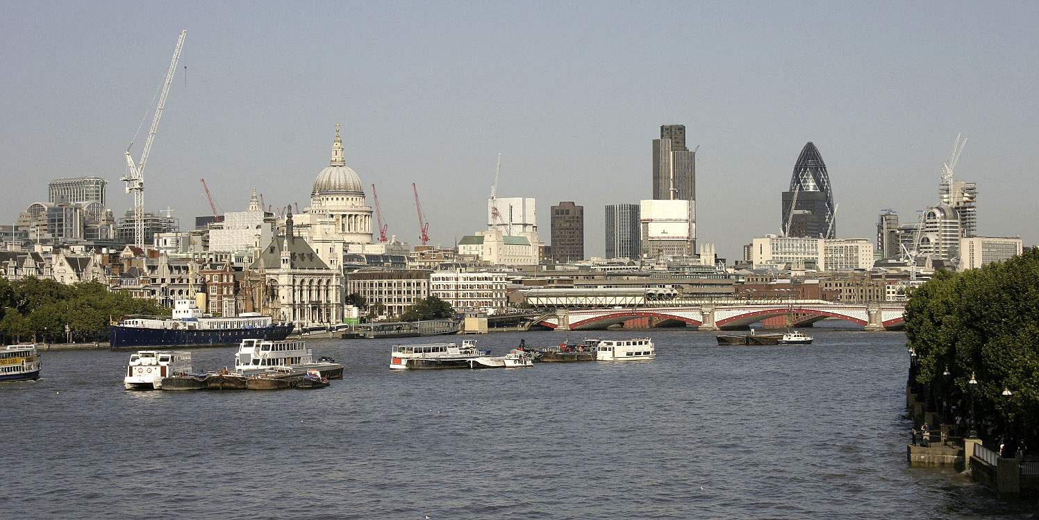
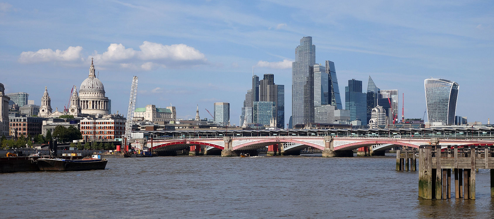
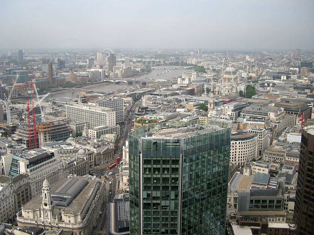
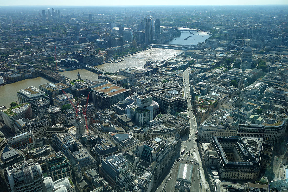
And now the photos tell a different story. Above, 2006, 2025, 2009, 2025, 2014. The London-wide ULEZ (Ultra Low Emissions Zone) that forced everyone towards hybrid and electric vehicles has had an effect. The buses and taxis don't belch fumes. The smell of a petrol exhaust is as rare and surprising as tobacco smoke. Like the indoor smoking ban, people complained, but they wouldn't want the old air quality back. It's happened gradually so hardly anyone notices.
I wish I had taken more photos of the skyline before 2010. I didn't because it was boring, and I didn't realise that I would want more 'before' shots to compare with what was about to happen.
29.06.25 / 01 / in pursuit of repetitive beats
Yet another instance of my life being treated as history. Nobody under 50 was there.
In pursuit of repetitive beats - a virtual reality adventure at the Barbican.
It's 1989 and finding the party is the only thing that matters.
Join in this culture revolution and travel back in time to the heart of the Acid House scene with the UK's biggest VR experience.
Using technology to create a truly collective experience, groups of four people can share the same virtual space and interact together as rave culture pioneers.
The rave scene has always been about organic, energised communities creating shared experiences in physical and spiritual spaces. With the world premiere of its newest version, In Pursuit of Repetitive Beats honours that spirit and unifies us all in a new and transformative way.
Strangely, they have an Access pack which describes everything, so I knew what was going to happen.
You need to see the making-of movies:
So…
The Tron-style parts took up too much time and contributed little. The exception was the radio-tuning part which was stunningly pretty, but we didn’t get enough time to really listen to the different 1989 stations. This lack of time was an issue elsewhere - you just get really into a scene and you’re being moved on - less of the Tron-filler please so we can spend longer in the content-rich parts! Of course, because I was there I’m more interested in the truthfulness of the detail, whereas some things that maybe seem exotic to a 20 year old are banal to me.
When you get to the rave scene, the crowd are grey silhouettes, not fully rendered people which would require a lot of computing power. And you don’t spend much time there, or hear a selection of tracks - which was the point of going there after all! The track is ‘Energy Flash’ which is from 1990 not 89! Our virtual hands are given virtual glow-sticks to wave around - this is a terrible cliche that didn’t really happen until 90s trance superclubs.
And then there is a weird section involving ‘glowing euphoria’ then floating through an empty wood and over a town. The documentary narrative gets lost here. Why not do a proper chillout and watching the sunrise section?
It was sanitised. No mention of the problematic aspects - drugs, drug dealers, money, untruthful promoters, criminal trespass, heavy-handed policing. Some of these things could be add-on modules or happen to random punters:
- police beatings and arrest (one for the haptic vest)
- buying drugs
- being sick from bad drugs
- being hit on by loved-up punters
- arriving to find it has been called off
In the car for the journey home sequence, the simulated guy in the back seat next to me looked ill - I don’t think it was intentional but the sheen on his face and the way he licked his lips didn’t look good. It would have made an amusing shock ending if he threw up. Virtual vomit of course so no-one would get splattered.
It’s funny how the experience of the music gets neglected. It becomes a background to the visuals. But the scene was built around exciting, euphoric, innovative music, and we need to hear and feel that excitement to understand the motivations. It wasn't the music of Kylie Minogue or Guns'n'Roses that drew people out to warehouses and fields. They went to hear a particular kind of music put together a particular way, that could not at that time be easily heard in any other way - unless you were part of the clubland in-crowds of London and Manchester. It democratised a marvellous experience that had only been available to a few.
I wonder how much the people who made this were into the music, even if they were there. Instead, it feels like there's a 21st century emphasis, on having a social experience with your friends because it's the must-do thing to do, and the actual content of the experience is secondary. Note the wording of the introductory paragraphs above which talk about community and experience but don't mention music.
So hmmm. Amusing but 1989 was not like this. I went home and listened to actual 1989 music from a cassette that was simulated in the VR.
29.05.25 / 02 / colours
For me the story of this year's Clerkenwell Design Week is the return of strong colours after a decade of muted pastels. It's refreshing but it raises issues about longevity. The most sustainable thing is to keep your furniture a long time (and good furniture will last 30+ years) - but what happens when colours go out of date?
The obvious answer is to put fashion colours on things that are easily changed, like upholstery or painted surfaces. But this year we have metal frames and solid plastic parts in fashion colours. So we will need to love our pink-legged chair even when that shade of pink is out. And learn to enjoy the datedness of things rather than seeing it as a reason to discard them.
On the other hand, Paul Smith used to say that the brightly coloured clothes in his fashion shows were there to get the photographs and the publicity, but almost all of the retail sales were the blue and black versions. Will furniture specifiers just pick the neutral colours?
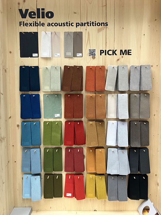
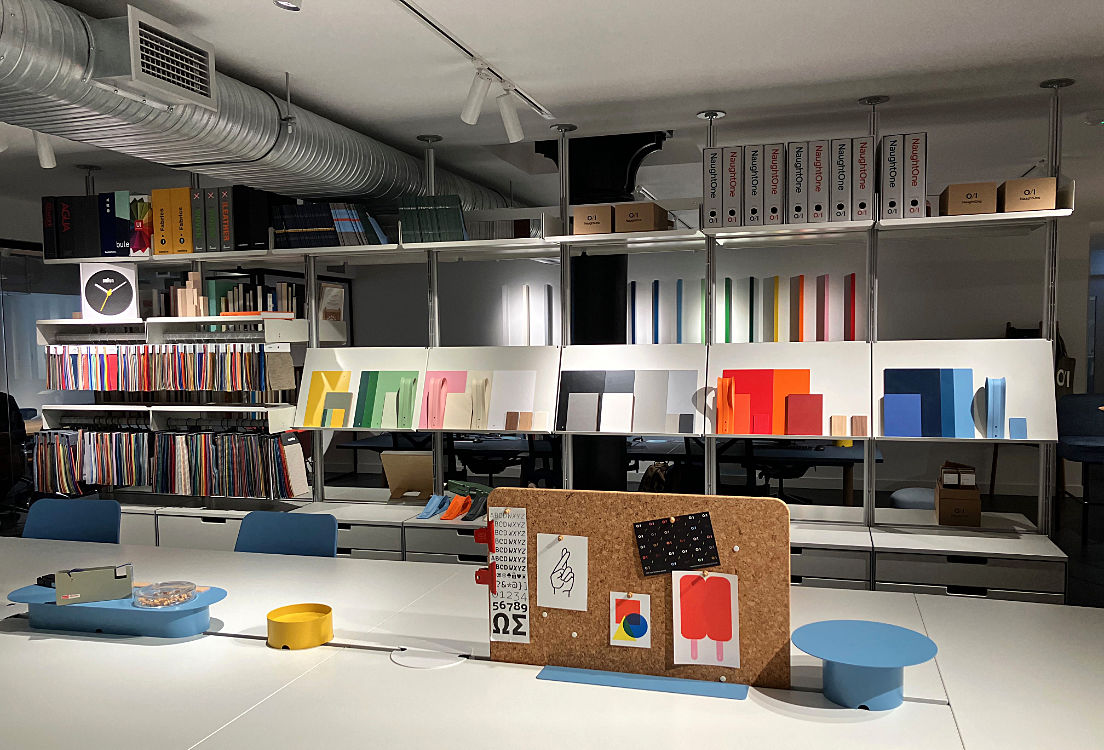
Above: Texaa acoustic fabric colours; Flokk meeting chair; Flokk task chairs and component colours; Modus chairs and storage system; NaughtOne colours for desks and chairs.
It's interesting to note what colours aren't there. Purples, plums, emerald green and millennial pink have gone. No sharp acid colours, no magenta, cyan, or teal. True brown is back for the first time since the 1970s, shading into ochres and russets - also rather 70s. Terracotta is popular. Greens are fresh but not bright. Colours generally combine in restful ways rather than clashing.
The fashion cycle of interiors colours is necessarily slower than clothes. Today's new colours will be ordinary everywhere in ten years. In twenty years they will be out of date and everyone will be trying to get rid of them. In thirty years they will be coming back at the sharp end in a different form. Right now the acid brights of the millennium are completely out, but the 90s are creeping back in - terracotta, ochre, orange, sky blues.
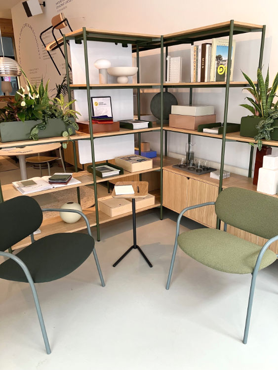
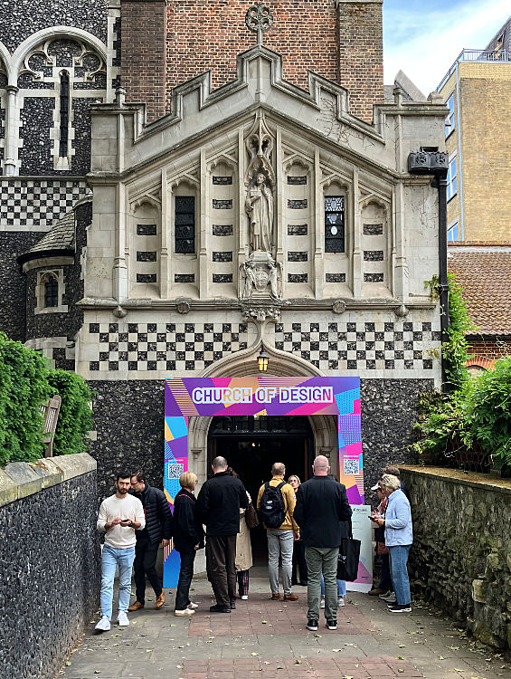
29.05.25 / 01 / church of design
This year Clerkenwell Design Week had a new venue - St Bartholomew's church. Of course I was interested in what this looked like, having recently photographed the interior. I was rather amused to find that it resembled one of my drawings...
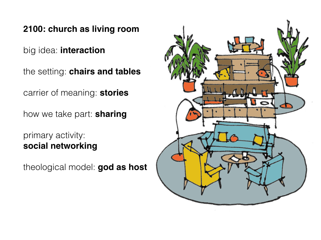
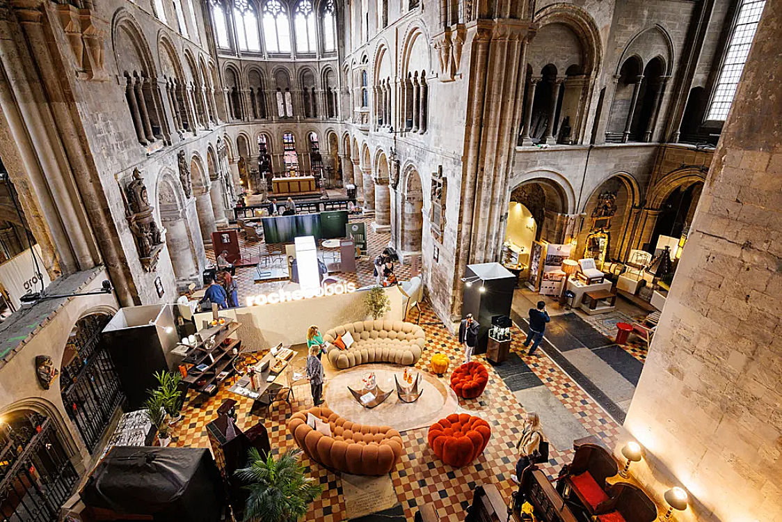
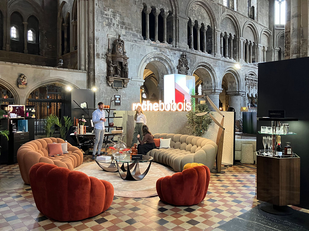
They should retain the Roche Bobois stand, without the sign but keeping the champagne and coffee bars. Why not? Maybe Roche Bobois could do it for free, if there was sales literature and a QR code. It's of mutual benefit. After all, the usual modern wooden chairs are advertising ecclesiastical furnishers to those who are shopping for that kind of thing. We should give them some other kinds of church furniture to think about. The next day I was discussing this with NaughtOne whose chairs are actually in this and other drawings in the series, because the 'living room' drawings derived from a fitout project we did.
06.05.25 / 02 / retrospective blogging again
Now that I can talk about it, I've added blog entries for the first months of this year in the archive, often from notes I made at the time. I haven't revisited last year, at least not yet.
One discovery is that my mother kept diaries from the 80s until 2019. Not novel-type diaries, but plenty of information about significant events and how she felt. It's good to write it all down for future reading.
06.05.25 / 01 / aphasia
My mother had increasing aphasia last year. Using odd words, not making sense. Saying entirely the wrong thing, because she can't find the right thing. Difficulty parsing written notes, three words at a time as if reading a foreign language. ‘Code break’ phrases that trip her line of thought into a repeating loop. Gesturing instead of speaking, especially in the evening. Lost words for objects, birds, plants, things she has known all her life. This combined with her severe deafness and lack of understanding could result in surreal exchanges:
Mum: What is the name of the plant?
Me: Cotoneaster
Mum: (laughs) What, like the name of a dog?
Mum: Do you have a car?
Me: No
Mum: That’s hopeful
(pause)
You can put it round your waist when you go to work
The 'code break' thing first manifested a few years ago when we were doing Lasting Power of Attorney forms. Section 9 begins 'I have read this lasting power of attorney (LPA) including section 8'. So she went back and re-read Section 8. And then she started on Section 9, until it said 'I have read this lasting power of attorney (LPA) including section 8', at which she went back and re-read Section 8. After five times I was going crazy, yelling "You've already read Section 8!!!"
That was a long hard day. It took six hours to get the forms signed. The next day she didn't remember agreeing to any of it and wanted to cancel the whole thing, but the neighbour was coming round to witness the documents and she was too embarrassed to stop him. I couldn't have safeguarded her without the powers of attorney. Do them before you get dementia.
05.05.25 / 01 / bereavement
A death from Alzheimers is not a sudden blow. You suffer bereavement many times by degrees as you lose things.
- When you have to take over your mother’s affairs behind her back, and lie to her every day.
- When you realise you don’t have a mother to talk to about what you are going through, and you’re the parent now.
- When you sit alone in her house, knowing she will never return to it.
- When they tell you she has only a few months to live, but can’t say exactly.
- When she no longer really interacts with you.
- When you get the call at 5:19am to say that she has died.
- When you see her body for the last time and say goodnight.
- When you walk away from the grave for the first time.
So grief comes by degrees also. I haven’t processed any of this, just parked it. The issue is not grief over her actual death, at least not now. It's the bottled-up punishment of over two years of difficult caring, especially the final six months of being an unintentional full time carer.
The whirlwind of arrangements that follow the death and never let up for a month or two distract from the pain. You don’t have time or energy to feel it, dwell on it or process it. Most of what goes on isn’t the sort of thing that triggers grief, not even the stuff about coffins and bodies. That’s all terribly practical or material for black humour. The real triggers are unexpected memories, or absences, which can be in themselves trivial.
As it turned out, part of the business of the funeral was to retrieve the memory of my mother as she was in life, and overcome or set aside the memory of what she became in the last years and months, the broken and distorted pieces.
02.05.25 / 01 / my mother
The unmentioned reality behind the blog after the pandemic was my mother’s declining health, and my increasing care responsibilities for her. I kept quiet about it because I didn’t want to expose her vulnerability. I mentioned it in 2023 after a three month stretch as her full-time carer, but the term Alzheimers was avoided, although those who have dealt with the condition will have understood what was happening.
After that period she was able to manage her life at home again, with daily care visits and long weekends from me twice a month. But her mobility deteriorated last summer, and I had to go and live with her again from August. The intention was to get medical diagnosis and treatment, make new care arrangements to suit, and step away. I thought it would take a month, but it took until December to get workable medication, and then I couldn’t get care support to cover it. So I gave up till after Christmas.
Suddenly one day in early January she was in such pain that I had her admitted to hospital. And then it all collapsed like a house of cards, both mentally and physically. I thought she’d be home in a few days, but after a week it was clear she needed too much care to ever come home again.
The NHS/social services process was to put her into a temporary care home for assessment, after which we would need to find a longer term solution. But then a doctor said, why are we bothering, she only has two or three months to live. Which was kind of shocking as no-one medical had expressed an opinion on life expectancy before. Trouble is, with Alzheimers no-one really knows how long, it could be one or ten months, so we had to carry on with the plans. And then she died in March, only six weeks after the prediction.
Then all the admin kicked in, masses of stuff. Arrange the funeral, tell the wider family and people she knew, register the death, deal with government agencies, bank, utilities, get the will, talk to solicitors, etc. I’m the executor and next of kin so the arrows point at me.
The funeral was a wonderful day, everything went perfectly and the weather was glorious. I had a bit of a break over Easter. It was my first entire week at home since last July. I just enjoyed the quiet and not communicating much, to give my overburdened head a rest. At some point I have to figure out how to resurrect my own life.
09.02.25 / 02 / countach
While we're on the subject, this recreation of the Lamborghini Countach is marvellous. Lamborghini should be ashamed. Their own 50th anniversary version misses the mark by comparison - fussy and cluttered where the original was spare and angular. It's hard to improve on one of the best-looking cars ever designed.
09.02.25 / 01 / history of the motor car
History of the Motor Car (Brooke Bond, 1968) is a peculiar collection. 50 cards running up to 1968 but the first 30 are before 1930. Only five American cars and none after 1930. 22 are racing cars.
The card captions don’t mention styling at all and the appearance of cars very little. They go into detail about the machinery. One has the impression that it was all put together by a vintage car enthusiast into tinkering with engines! This is an emphasis that I notice in other (British) car books of the period - the kind of people who were writing them at that time probably did spend their pre-war youth tinkering with sports car engines.
The key development of the 1930s was that the shell of a car (and therefore its appearance) became separated from the machinery underneath - for reasons of aerodynamics, but then the idea of styling - that the appearance of a car could be changed year on year to stimulate sales regardless of the engineering.
I would have cards for the Chrysler Airflow of 1934 to talk about this, give the Citroen Traction Avant its own card not just an illustration, and maybe add a Tatra as a radical and influential development.
For postwar cars I would add a 57 Chrysler or a 59 Cadillac for the fins and to discuss the business of yearly styling updates. Maybe the Corvair, for its design influence and safety issues. From a British angle I would add the Ford Cortina - the future of the mass market. Perhaps a bubble car! All of the above to be achieved by omitting some of the obscure vintage cars.
In a way the 60s were a competition between the Issigonis idea of the car and the Ford idea. Issigonis was an essentialist - cars should be what they are, should have the most advanced engineering possible, should have the most room in the smallest space, should not be styled for passing fashions. Ford preferred conventional engineering, periodically refreshed styling to give a sense of newness, options packages for personalisation. Ultimately the Ford approach won, because it understood the car to be a social and aspirational object.
This was a subset of a wider battle between Modernism, seeking the essential, functional and unchanging form, and consumerism, seeking social positioning and personal fulfilment. This is something that nags away at me at the moment, because the turn to consumerism has been so damaging ecologically, in a way that a Modernist world of just-enough would not have been.