Grace 15 website 2015
 |
 |
 |
 |
 |
 |
 |
 |
 |
 |
 |
 |
 |
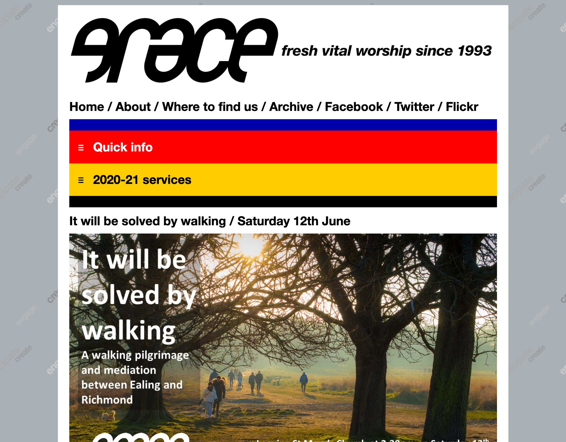
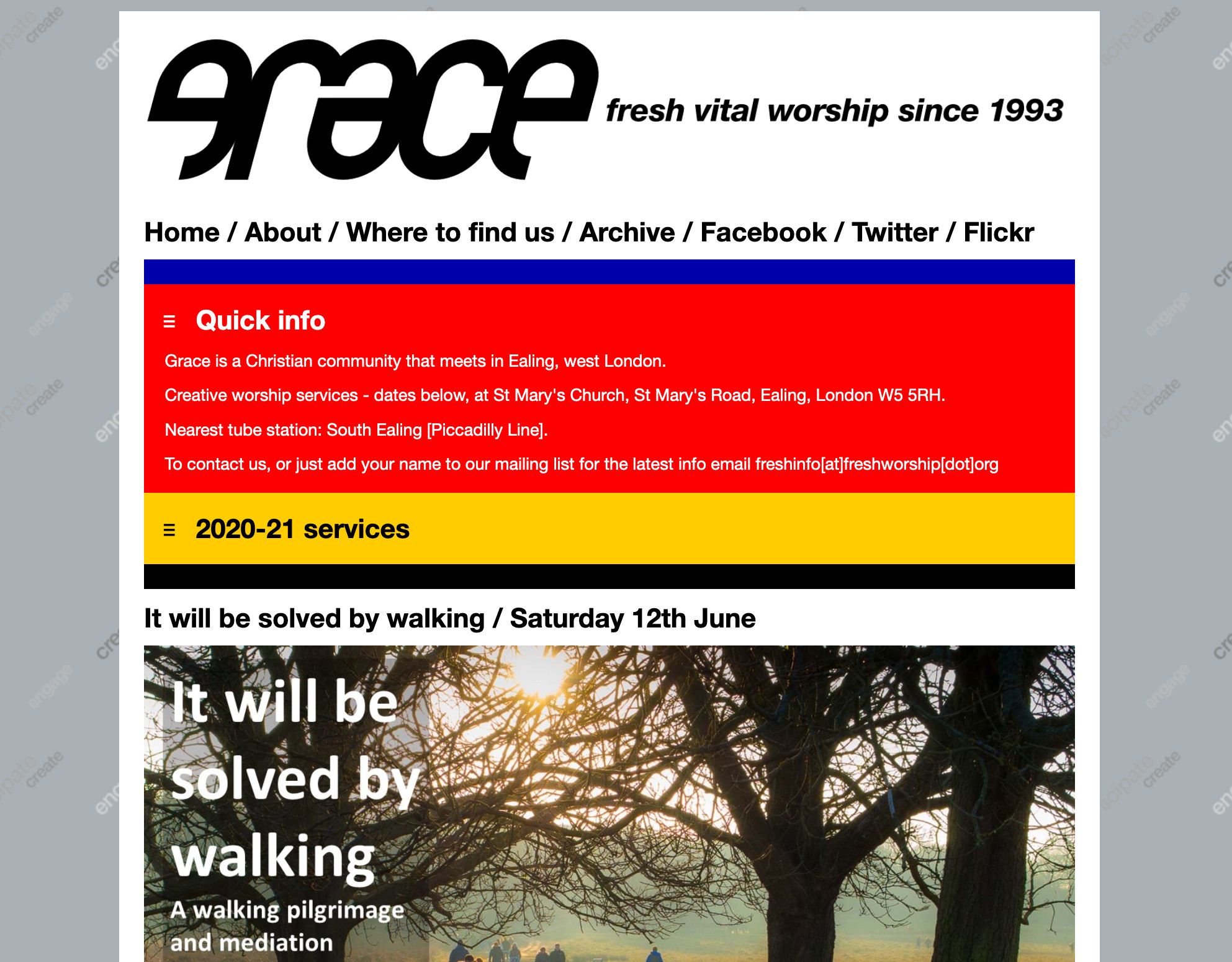
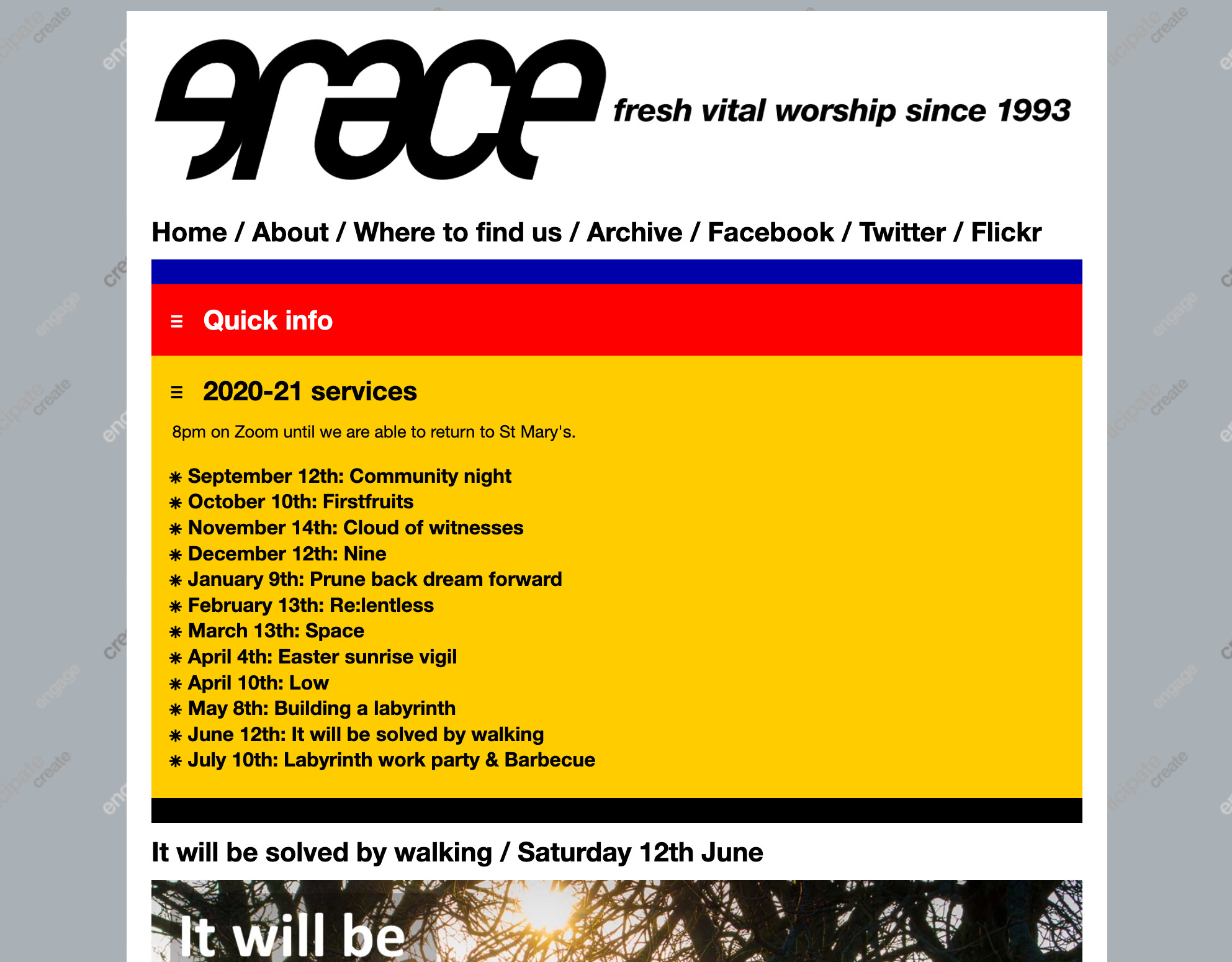
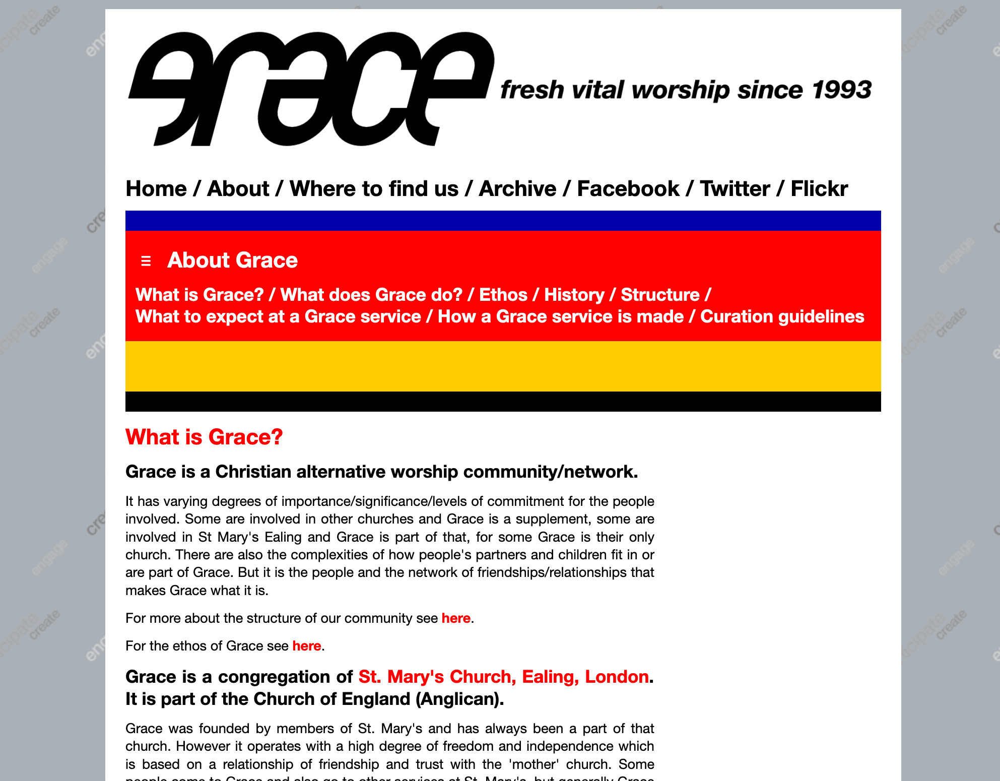
Grace 15 was my first responsive site design. The narrow format assumed only vertical scrolling. The background carried the 'ethos' words as in the previous iteration. The colours were taken from previous versions of the site. |
Home page menu first drawer - Quick info ie FAQs. |
Home page menu second drawer - the current year's services. The basics of what and where have therefore been covered at the top of the home page. The latest service flyer and info is below. |
About page. The yellow is kept for the sake of the stripe but doesn't contain a submenu here. |
About submenu down. |
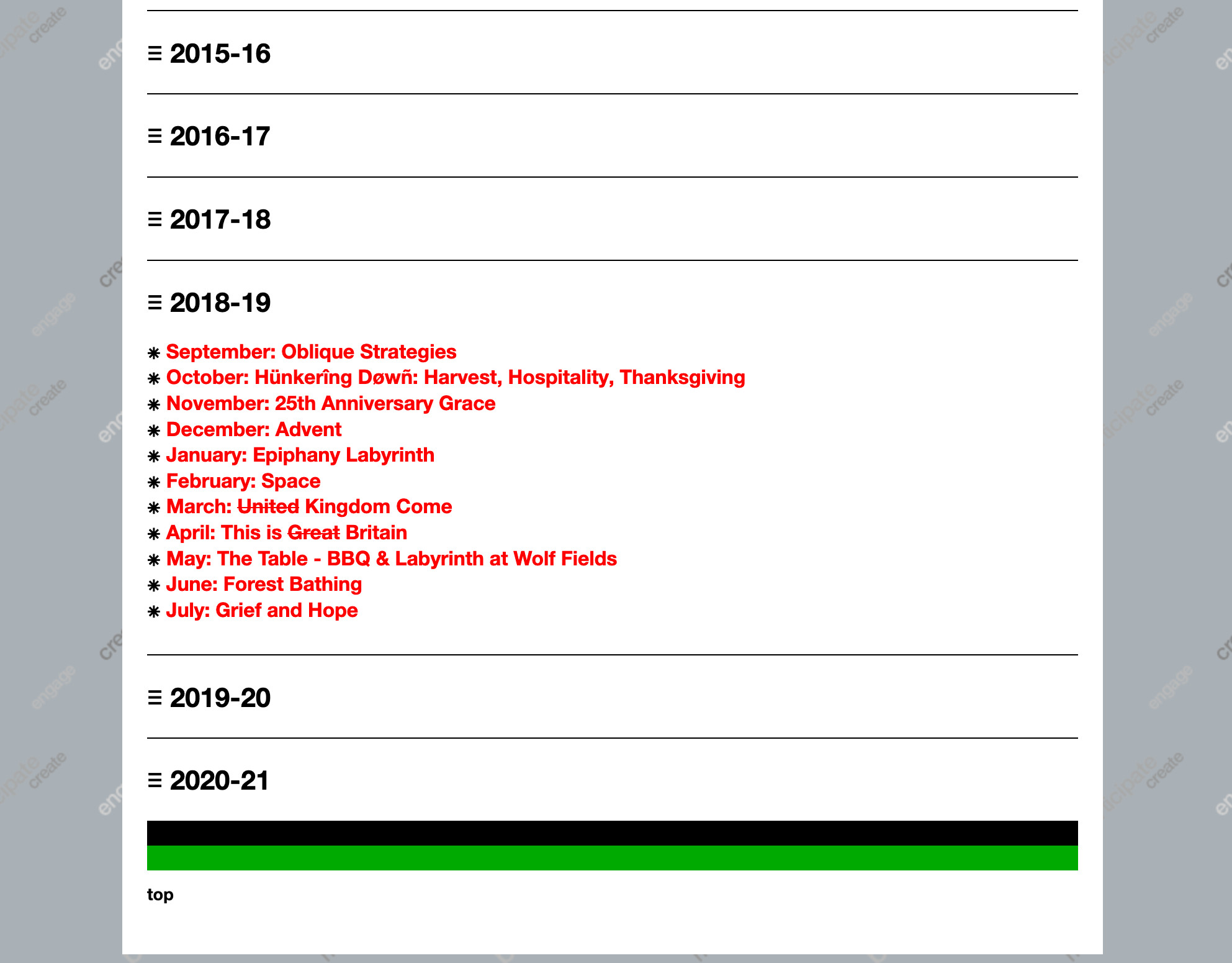
Services and events menu page - year by year in drawers. The only way to handle a very long page (now 30 years and growing!) |
Drawer open with links to service archive pages. Green stripe at the bottom of the page (and all others). |
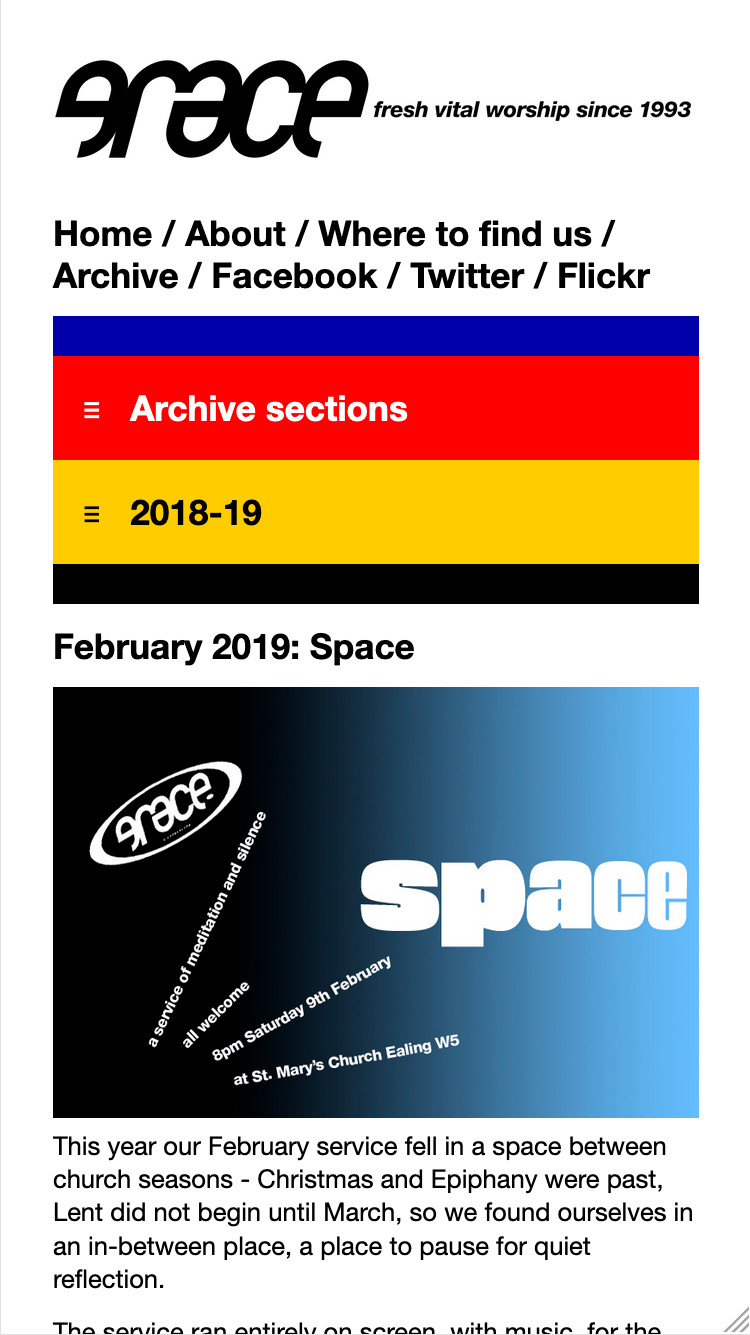
Archive page for a service. Flyer at top, details of service below. Red menu for archive sections, yellow menu for that year's other service archive pages. All archive pages also connect to the next and previous events at the bottom of the page. |
Phone format of home page. |
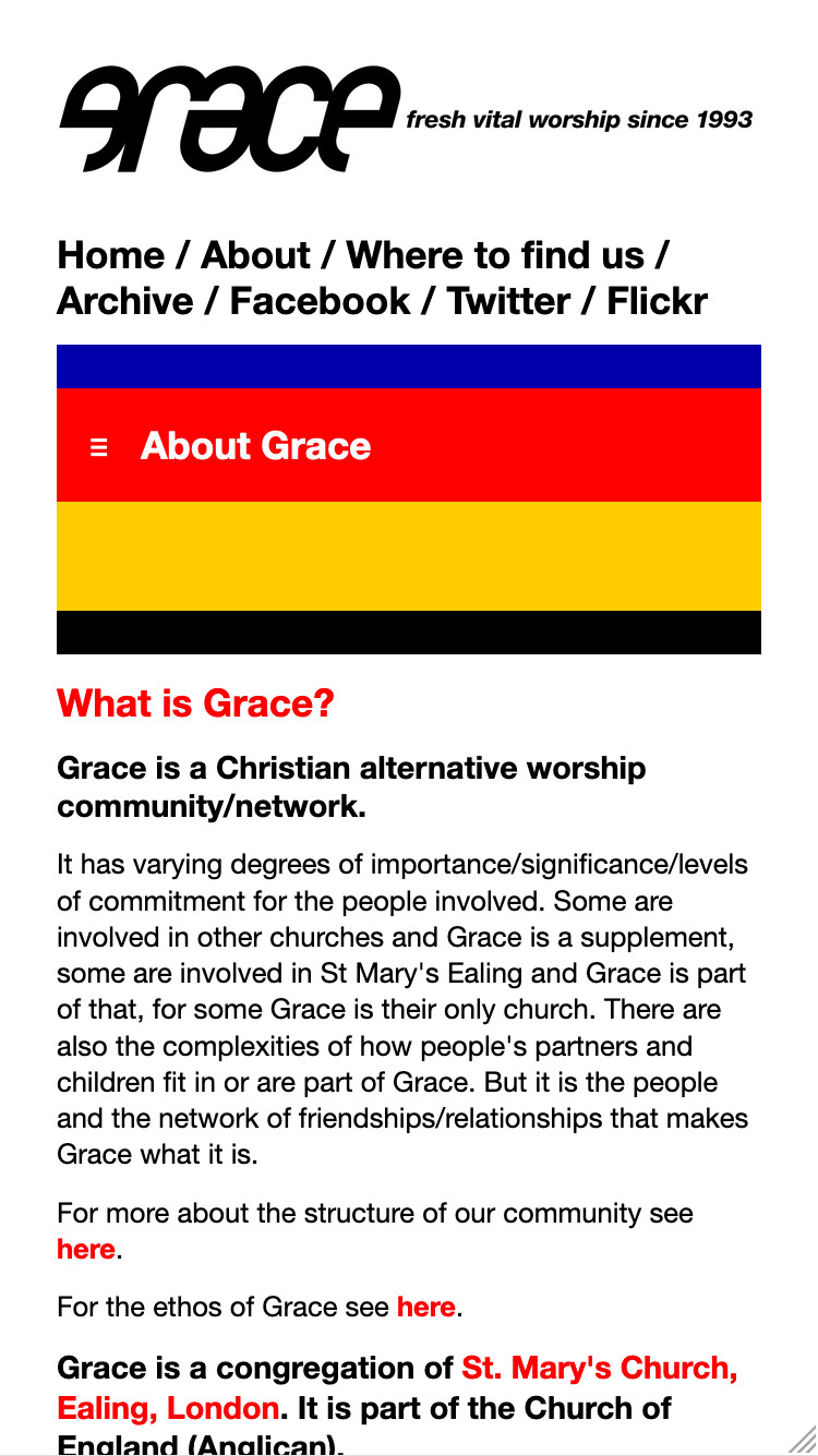
Phone format of About section page. |
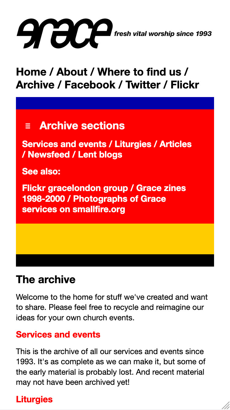
Phone format of Archive section page, with menu open. |
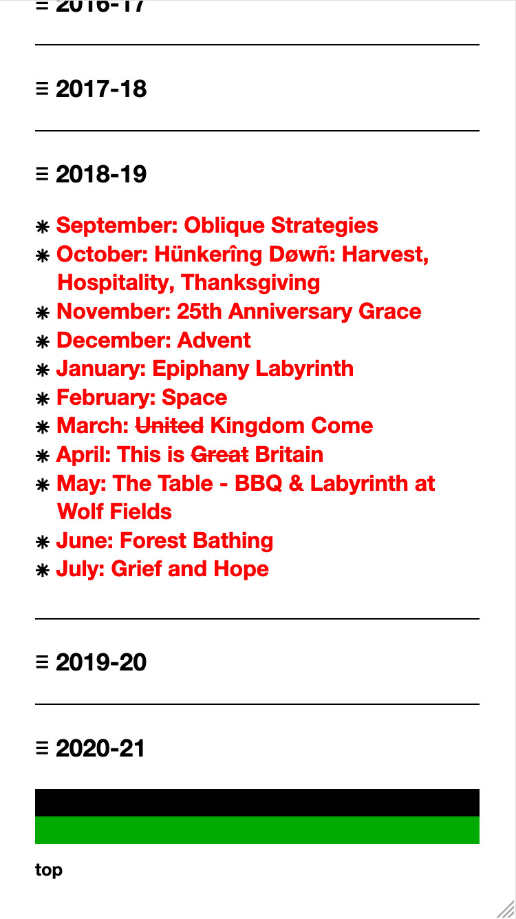
Bottom end of services menu page, with a year submenu open. |
Phone format archive page for a service. |

