Blog archive May 2015
27.05.15 / 01 / supersymmetry
Installation by Ryoji Ikeda at Brewer Street Car Park in Soho. I wish I could capture the incredible pin-sharp detail of the screens - the slight glare blurs it on the movies.
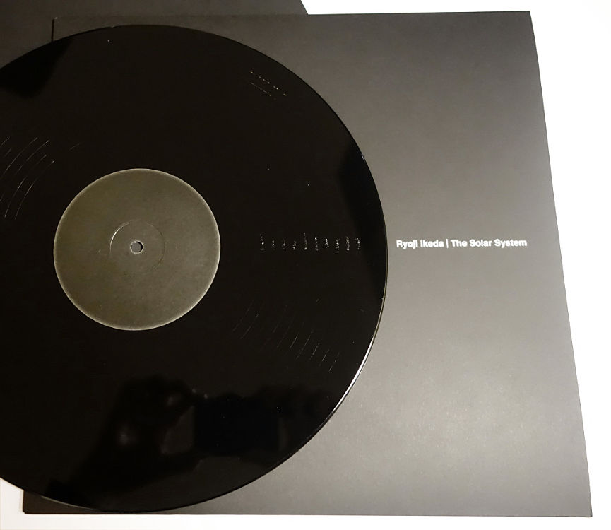
On the way out I purchased The Solar System.


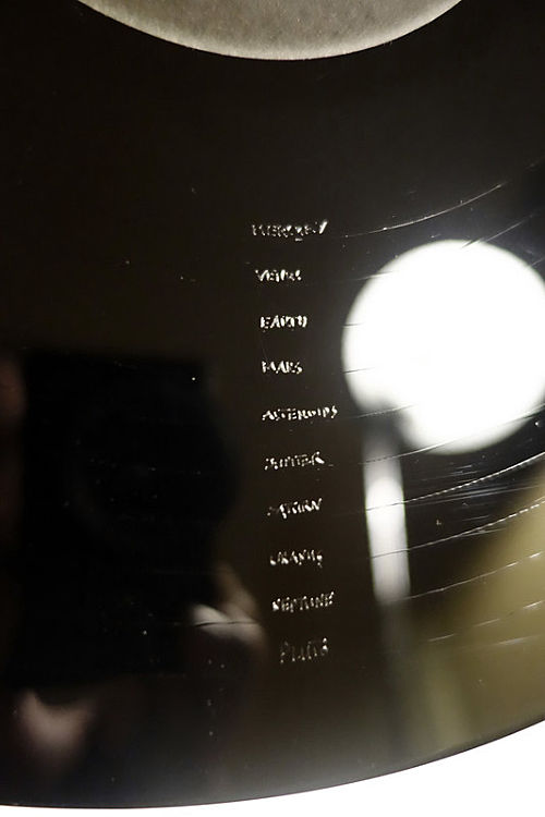
This record has 10 locked grooves, each consisting of a unique sine wave with a different frequency correlating to a different planet in the solar system (yes he includes the asteroids and Pluto!). It won't be easy to play, because there is no run-in groove - you have to drop the stylus exactly on the groove or risk scratching it.
25.05.15 / 01 / milton keynes
the recent death of derek walker, the chief architect of milton keynes, has finally given me a pretext to make this blog entry which has been sitting on my phone for 18 months! in fact my musings were prompted by iqbal aalam's photos of milton keynes 1970s architecture, his comments and my own remembrances of the period.
i like the idea of milton keynes as originally envisaged, a city based on the grid, a city as network imposed on preexisting settlements and countryside as a new idea. the early buildings by the development corporation can be read as symbols of this, making manifest what would otherwise remain hidden or only felt in the new geography of distributor roads.
most of the original architecture is relentlessly orthogonal, gridded surfaces in tiles and mirror glass. much of it is under threat as people forget about or reject the almost mystical devotion to the idea of the grid that motivated the original designers. it should be appreciated as a matter of historical style, as much as we appreciate victorian floridity or georgian classicism. milton keynes represents a technocratic pastoral ideal, the mindset and lifestyle of 'tomorrow's world' and the bbc micro - as if postmodernism never happened. the technomysticism was also manifest in the now demolished bletchley pyramid and the ley line alignments of the city centre. no doubt pink floyd's 'dark side of the moon' was on the design studio turntable.
somewhere in this is the lost dream of a rational and balanced society, of public and private sectors working together on common goods. the grid in this world belongs to the public sector not the private. it lays the ground rules and mediates between competing interests. it opens up the spaces but sets the boundaries. the gridded buildings that sprang up in existing towns and villages were manifestations of the new order, mushrooms springing from the underlying threads.
milton keynes was part of a 1970s british vision of soft technology, of grids and mirror glass emerging from or consumed within lush landscapes, of the greening of buildings with earth blankets and solar orientation. perhaps the most extreme and poetic projects in this vein came from archigram in their last years, where hedgerows were infrastructure and office buildings became hills. even foster got in on this, with the insulating grass roof at the willis building - and what is the symbolism of the endless green carpets in his 1970s work?
there is an ideal early 70s occupant for these places, in their 20s, unisex flared jeans and feather cuts, educated at a new university, liberated, forward-looking. classless of course, free of historical baggage. ecology, astrology, computers. ley lines and punchcards. in the event there were too few of these people to sustain the technopastoral lifestyle intended for places like netherfield.
24.05.15 / 02 / event structures
- don't predetermine activities or tie too closely to specific rituals.
- maintain a gap between form and activity.
- use form to question ritual not confirm it.
- pay attention to high level symbolism and enable contrary readings.
- be particular to place and people.
- introduce ideas from other disciplines to induce tension.
- insist on beauty, but shun easy beauty.
- never lock in power structures or hierarchies of any kind.
- enable dissent.
- enable participation.
- invoke alternative worlds and paradigms.
- refuse to confirm the present order.
24.05.15 / 01 / dawn of midi and nils frahm
friday night was with jonny, mike and dean to see nils frahm at the roundhouse, supported by dawn of midi.
dawn of midi played the whole of their current release dysnomia. they are in format a jazz trio, drums/double bass/piano, but for dysnomia these instruments are used to produce something resembling electronic dance music crossed with classical minimalism. it requires astonishing physical and mental control to play such precise and repetitive music for so long - the moments of transition between tracks, where the tight structures loosen before locking into new shapes, seemed like breathers inserted to relieve the musicians. most of us would go mad if we had to play one note on a piano, over and over again in exact time for ten minutes, with the other hand inside the piano damping the string to remove the decay from the note. given the increasing ability of acoustic, analogue performers to reproduce the aesthetic of digital, sampled music one wonders how long before a live version of 'tomorrow never knows' - the ur-example of music that 'cannot be reproduced live'.
frahm had a new toy - a wooden pipe organ in three parts, church-sized, square pipes like a flat-pack. he made the audience laugh with cuckoo-clock music on the high notes, developing into a fairground-organ sound. later he physically shook the venue with the lowest notes of the organ. he played the inside strings of the grand piano with toilet brushes. in spite and because of all this, the music was very beautiful. it escaped genre - was it chill-out electronica, was it classical, was it film score music, was it a very sophisticated easy listening? much of the most interesting music now seems to be in this area of collapsed boundaries between classical and pop genres, and yet the results escape the soft-classical or prog-rock kitsch that happened last time. i suspect that minimalism and edm provide a tougher backbone.
frahm's technical ability on the piano was truly stunning, pounding through long difficult passages with sweat dripping from his face, sometimes with one hand playing the piano and the other hand playing the organ. standing ovations resulted, never mind that half of us were standing anyway. the ovations were genuine, unlike the artificial process one usually suffers. thoughts of liszt arise. it was a wonderful - concert, rather than gig.
the next day, facebook came up trumps for the first time by advertising the erased tapes stall at a record fair near elephant and castle. i rushed across town to grab some cds - it seemed the most efficient thing to do. i was tempted by the limited edition of dysnomia on clear vinyl, but on reflection it seemed perverse to split that work over four sides.
postscript: the CD packaging is really nice - card inner and outer sleeves with booklet, like a miniature LP. this is so much nicer than the plastic cases or even the folding card cases with a plastic holder, that i wonder if the superiority of the 12" LP cover isn't only about size. there is something about the tactile quality of the card sleeve and its sliding action. see also beatles mono set, station to station box set etc. funny how it took us until CDs were obsolete to figure that out.


