Blog archive March 2024
<< February 2024 / April 2024 >>
25.03.24 / 01 / a metaphorical landscape
In recent years there have been a number of furniture ranges aimed at the ‘agile working’ market. Draggable, pushable, modular. Writable screens that you can tuck under your arm and put up on easels. Desks with wheels. Carts and screens with wheels. Everything with wheels. It’s all good, functionally speaking. Assemble it to suit your work-group needs. Drag it somewhere else tomorrow.
But the design language of these ranges tends to be utilitarian. Just doing the job. Tubes and castors and laminate and boxes. I don’t find much pleasure, not even the pleasure of the truly utilitarian, the industrial or artisanal.
I want a metaphorical language. Something that makes a place, that speaks to the imagination and the emotions. I’ve only been thinking about this recently in explicit terms, but looking back all my stuff has worked like this. I’ve always been influenced by Ettore Sottsass and Archizoom, the speculative environments of Italian anti-design designers around 1970. Chairs as grass or baseball mitts, beds as tombs, offices as deserts or jungles.
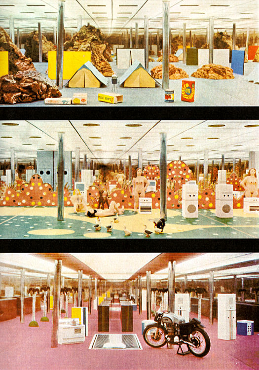
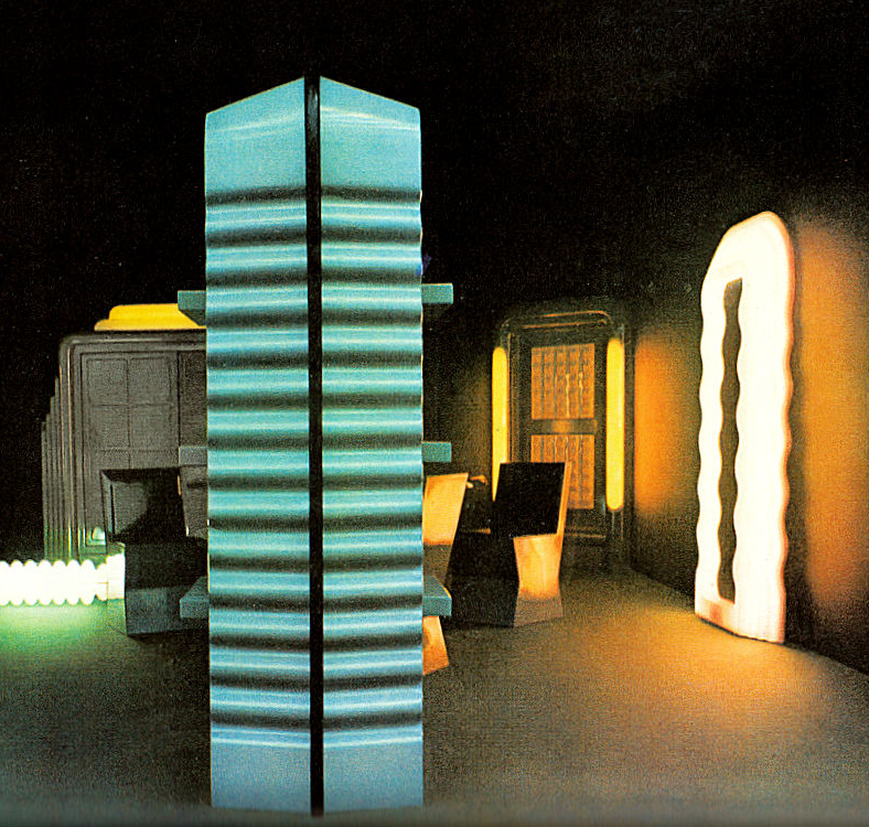
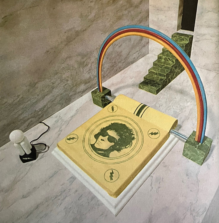
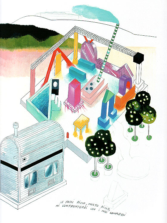
Above, Archizoom 'No-Stop City' 1971, Ettore Sottsass 'Grey furniture' 1970, Archizoom 'Dream Beds' 1967, Ettore Sottsass 'If I were rich I would confront all my complexes' 1976.
We live by narratives. The narrative of 00s furniture was, we are corporate, global, technological. Once this was refreshing! An escape from the provincial and small. The narrative of the 10s was, we are hipsters in a startup. This was more fun, but it was mostly a lie. Both these narratives were totalitarian. Everyone has to play.
I don’t know if a poetic approach is any free-er, but can it allow for more ways of being? A diversity, to use the currently fashionable term? I’m not sure how much organisations like this.
24.03.24 / 01 / goodbye monotype
Since 2015 I've had a subscription to Monotype via fonts.com, primarily to enable webfonts on my sites. Grace is of course Helvetica, and smallfire.org and smallritual.org were Neue Haas Unica which is an 'improved' Helvetica - a font geek font for those who can tell the difference. I hoped that webfonts would make a slightly more professional experience and deal with some of the crudity of Windows font rendering.
But Monotype have been closing down fonts.com and transferring all accounts to the main Monotype site myfonts.com. At least that's what they said they were doing, so I assumed a seamless transfer. I suddenly got an email last Monday telling me that my subscription expired that day and I needed to sign up to a new plan to continue. At four times the previous cost.
Investigating online I found angry people on Reddit whose clients were struggling with massive price increases or they lose their brand font libraries. Turns out Monotype was bought by private equity who are screwing the customers and fattening it up for sale.
It was always quixotic of me to subscribe to get a better class of Helvetica - I had periodically questioned why, but it was affordable. No longer. So I didn't renew.
All my sites have reverted to basic Helvetica/Arial, with a few small adjustments. Even I can hardly tell the difference on the Grace site. smallfire.org lost the heavy and light font weights, but it's hard to tell what's changed unless you directly compare.
smallritual.org looked bad. Turned out the nice generous highlighter effect was a function of the webfont, somehow. In basic fonts the background colour shrank to the actual text and ugly gaps appeared. I almost gave up on the idea, but then tried adding a thick matching border to the link style - it worked. But I'm sore about losing Unica.
This is why every firm that rebrands now commissions its own fonts. It's cheaper to pay someone to create a font than pay exorbitant license fees indefinitely. Maybe we should commission a Grace font. Trouble is it would have to be similar to Helvetica ;-), and there have been so many new fonts in that space in recent years that I can't imagine how they create enough differences to avoid copyright issues.
12.03.24 / 01 / hearing loss
I was finding it hard to hear what Jonny and Mike were saying to me in the Jazz Cafe, even though they were next to me. This had been coming for a while, so I booked a hearing test.
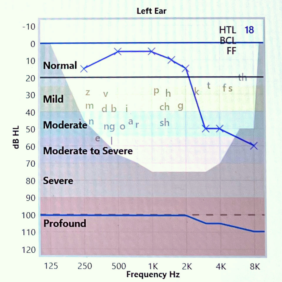
The left ear - the good ear - is losing the top end due to age. If one more data point drops I will need a hearing aid. It’s actually better than I thought - just that losing the high frequencies reduces clarity of speech.
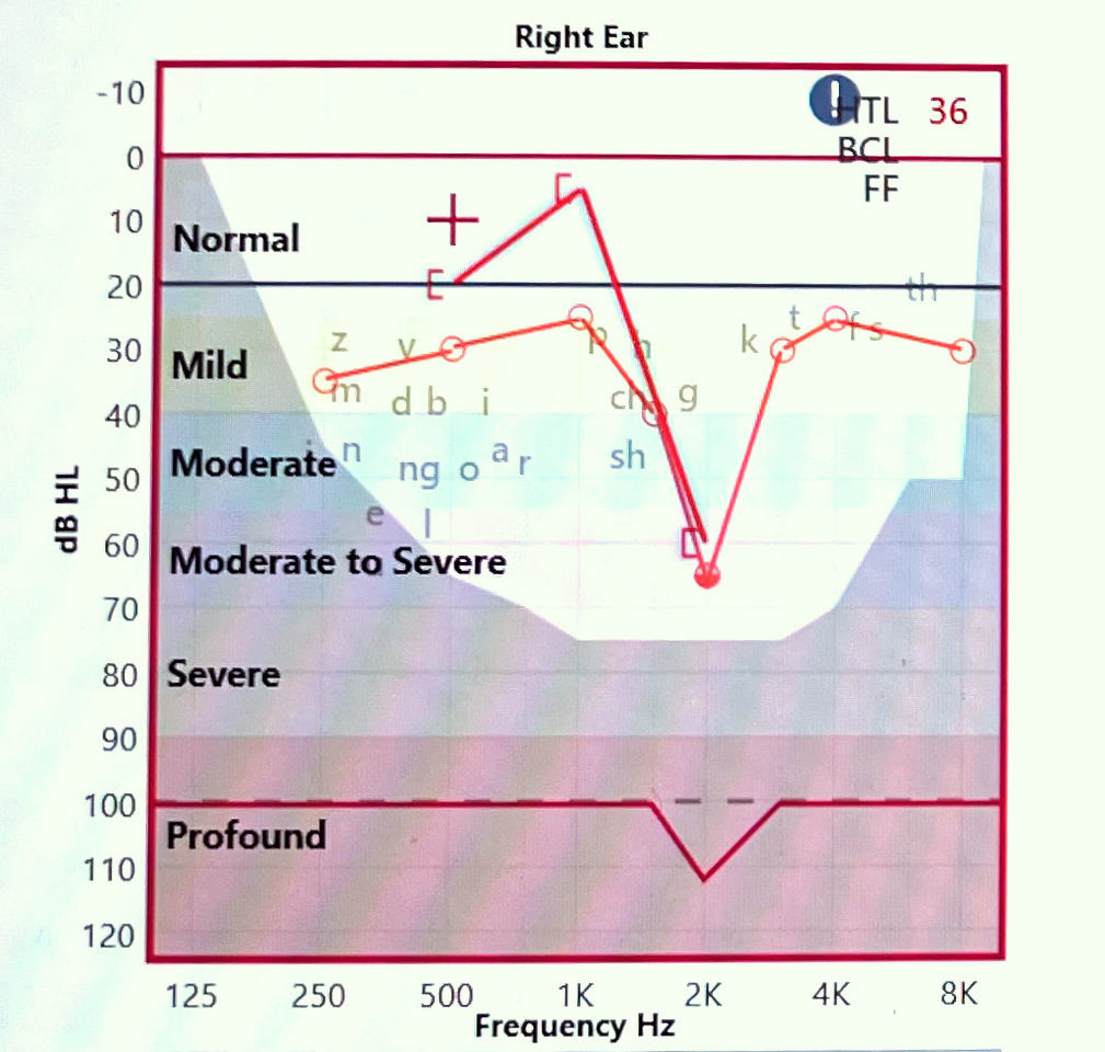
The right ear was damaged by a badly programmed drum machine at an all-nighter in Brixton Academy in 1991 - The Shamen headlined I think, but the drum machine belonged to Meat Beat Manifesto. The hi-hat was way too loud and penetrating. I felt it at the time, but my hearing collapsed a couple of days later at a church pantomime rehearsal. It was ‘Mother Goose’, and the woman playing the goose gave a loud and piercing squawk, again and again - my ear was agonisingly painful and I had to leave and seek medical help. It took five years to recover to the point of being able to be somewhere with amplified music, and then only with an earplug in my right ear.
To this day I carry earplugs with me everywhere, in case of a loud environment. I often put the other one in to protect my left ear - because once the damage is done it’s too late. The earplugs reduce the volume, but more they soak up the risky high frequencies. Many venue sound systems are amazingly harsh - I feel that I get a better experience with earplugs. I know that the sound system is really well balanced when I can take both earplugs out - no stray high frequencies.
I had no record of the early 90s hearing tests, so was curious to see what it looked like. Overall there’s less hearing loss than I imagined, but there is what they call a ‘notch’ at 2K - a big one. The hi-hat took the nerve cells out, WHAP! I didn’t want a hearing aid at this time, I’ve lived with it for 30 years. When the good ear needs a hearing aid I will try both.
Tinnitus - of course in the right ear, but it’s diminished over time (or my brain tunes it out). At first I wondered how I could cope. I remember resting my head against a gurgling fridge to get relief. Sadly the left ear now has tinnitus too. I know when a room is really silent because I hear piercing whines.
I had forewarning of all this. My hearing had been noticeably reduced by listening to acid house all day on a Walkman 1988-90, apart from clubbing. I had no regrets. My feeling is, your body will wear out anyway, so try to get the damage in cool ways (note that I ascribe the hearing loss to a drum machine not a church panto goose). Damage as a memento of doing something interesting.
11.03.24 / 01 / UVA at 180 Studios
I saw the UVA exhibition at 180 Studios in December, but they offered a ticket upgrade to membership at half-price so I took it. The other day I went back 'for free' to get a couple more movies. My favourite is Musica Universalis, a simple but clever idea.
Above, Musica Universalis, the red sequence.
Above, Musica Universalis, the blue sequence. A still of this did well on Flickr Explore.
Above, Edge of Chaos.
Above, Our Time.
Above, Chromatic.