smallritual.org 21 final 2023
 |
 |
 |
 |
 |
 |
 |
 |
 |
 |
 |
 |
 |
 |
 |
This version went through many iterations of main menu and header colours (all blue/grey/black) and logos (mostly trying to look like something off a car). This is the final logo, by far the best but it didn't feel right and the next logo prompted a restyling of the site. |
The main menu is reproducing the look of certain British Rail and London Underground documents. |
Main menu bar at the top. Images swipe horizontally within a window. |
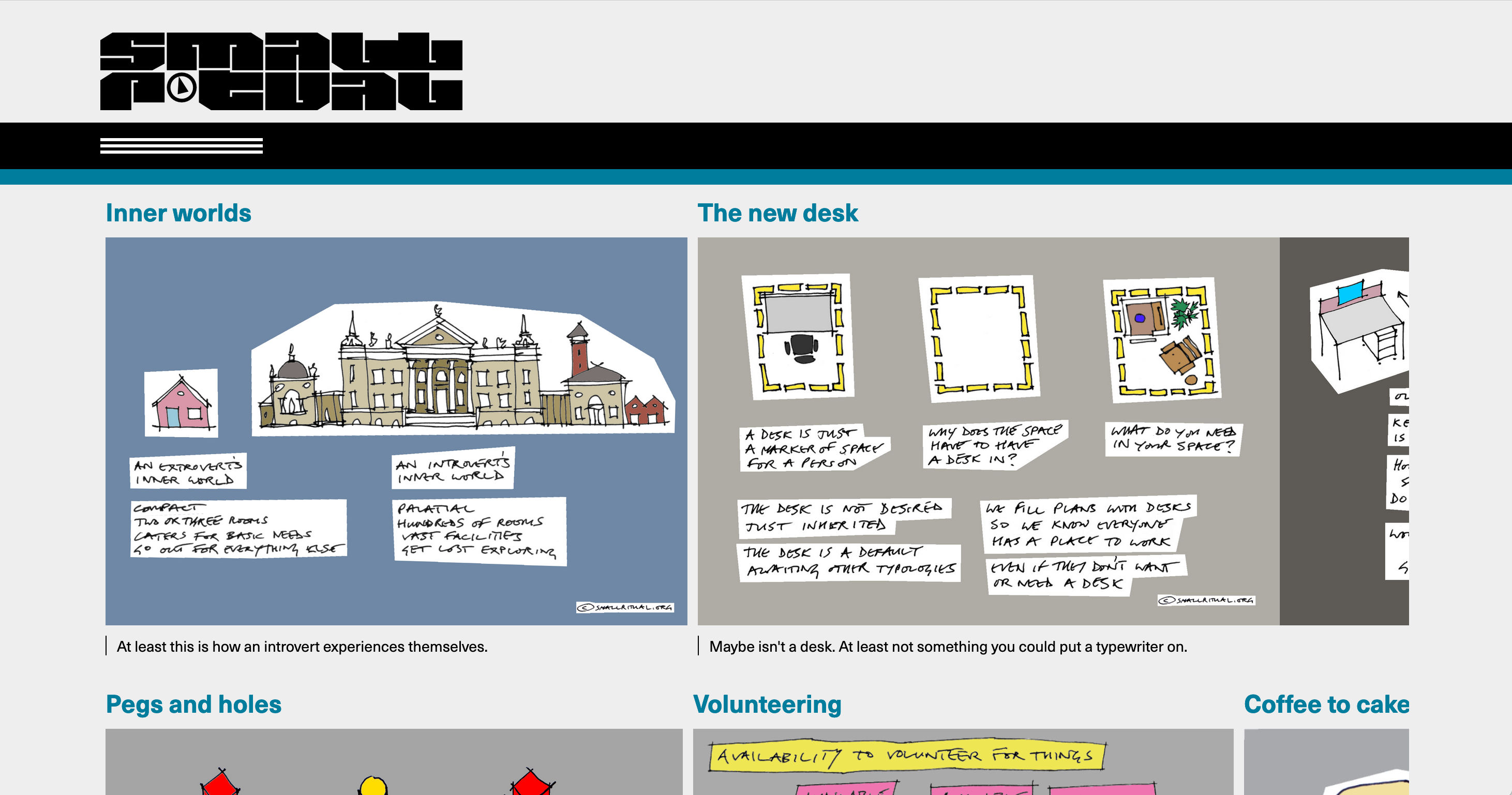
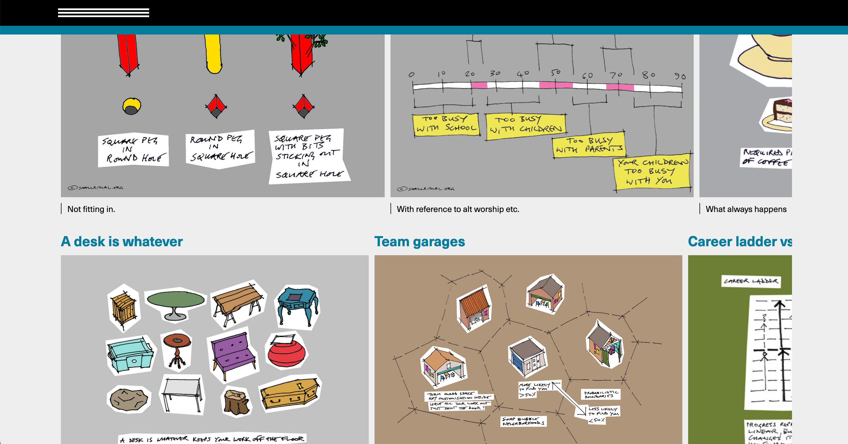
Blog or text page. The intention was modernist and minimal, just typography and blue accents. All the logo designs seemed to unbalance it. smallritual is a difficult set of letters. |
Blog or text page with main menu at the top. |
Blog page with main menu down. Perfect British Rail styling! |
Section menu page. |
Section menu page with main menu down to show relation of both menus. |
Image page. Images swipe horizontally within a window. |
Phone screen. The image size gets enough on screen at once for legibility. |
Menu bar sticks at top. On a phone the logo is usually hidden. |
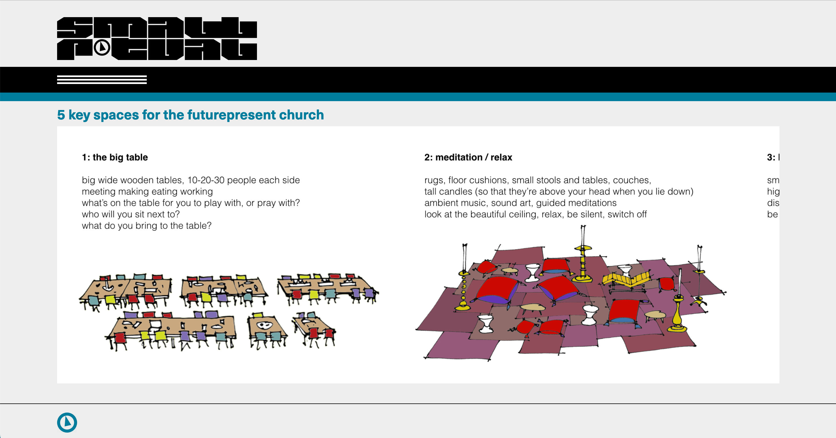
Blog page. |
Blog page with main menu down. |
Section menu page scrolled to bottom. |
Section menu page with main menu down. |