smallritual.org 19 2019
 |
 |
 |
 |
 |
 |
 |
 |
 |
 |
 |
 |
At this point I put the tramlines back, hankering after the framing effect of versions 10-15. The compass was now the only logo. |
This design was about coloured horizontal lines scrolling vertically between the tramlines. The main menu dropdown emerged out of three coloured lines. |
Section menu page. |
Image page, with horizontally scrolling image strip inside fixed-width window. |
Text page. |
Blog page with main menu down, showing the effect of the coloured lines. The burger and main menu now stuck at the top of the window. |
The phone screen arrangement had only horizontal lines. The compass made a nice target for returning to the homepage. |
One of my design constraints is that the main and section menus should be of the same type and align. |
The burger and main menu stuck at the top of the screen. |
The images swiped horizontally within a window. The image size gets enough on screen at once for legibility. |
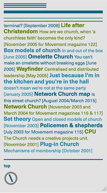
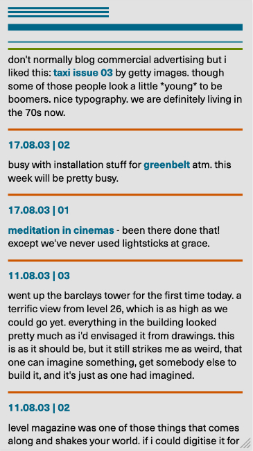
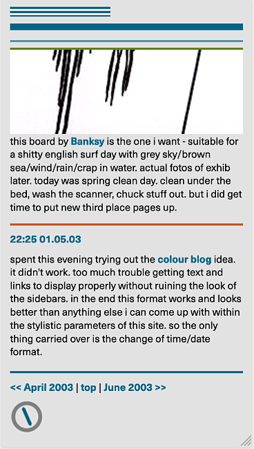
Blog page with orange lines, playing against the blue/green site lines. |
The blue line and compass tell you it's the bottom of the page. |