Blog archive December 2024
31.12.24 / 01 / haptics
This blog entry has been hanging around unresolved since the summer, but maybe it's time to publish the half-formed thoughts to get it recorded. I was thinking of stuff one carries in a pocket or bag, and uses for the feel of it - rosaries, wood bears, pebbles. My thing is rosaries or similar prayer beads - I’ve never really figured out how to pray on them, but counting the beads through my fingers is calming - can send me to sleep sometimes. There’s a certain size and weight of bead that works, it should be just round beads of different sizes so you can feel the divisions without looking.
Maybe one could throw in a Braun calculator - the ET55 has buttons with a slight click that feel good. Or a Parker Jotter - the perfect ballpoint, always works immediately, the engineered click of the button. I use my grandfather's 1963 one.
Give yourself nice small things, eg wallet, business card holder, pen, water bottle etc. Well crafted, good to look at and touch. Finding pleasure in small luxuries, not necessarily expensive. Choose things that have longevity and wear well - enjoyable ageing not just tatty and grubby. How many things get discarded because they look bad/embarrassing before they have worn out?
We often do it the other way - spend on big luxury items but have cheap small things, so what’s closest to us all the time is cheap.
21.12.24 / 02 / rail symbol 2
When the effective renationalisation of the railways was floated in 2021, it was said that the logo of the new organisation would be a modified version of the British Rail double arrow. This was welcome but the mention of revisions was concerning, given the untouchable elegance of the original. I needn’t have worried. The update is a very subtle re-proportioning by Nick Job that makes the symbol more usable and less prone to bad executions. This is a heartening tale of an enthusiast who makes a difference. Job was concerned by the frequent errors in the drafting and use of the symbol, even in official documents and signage, and approached Network Rail with a proposal for respecifying it. This was well-received and Job got his dream job. Now he really needs to update his websites...
The manual revives the old elegance of the British Rail Corporate Identity. Amusingly, Section 1.7 Incorrect Usage carefully forbids all of the non-standard uses that actually happened under British Rail, even the ones that had official permission!
The name change - Rail Symbol 2 - is significant. It was the logo of a particular organisation. When that organisation disappeared, it did not vanish as expected. It had become a symbol for railways and stations due to its use on signage. Nobody could think of anything better to replace it that would just mean ‘railway’, and it would cost too much to replace all the signs anyway. So it remained everywhere, as a kind of ghost of its parent organisation, neither living nor dead, with no certain future. Now calling it Rail Symbol acknowledges what it has become, not a logo but the symbol of railways in Britain, regardless of organisation or ownership.
21.12.24 / 01 / rail alphabet 2
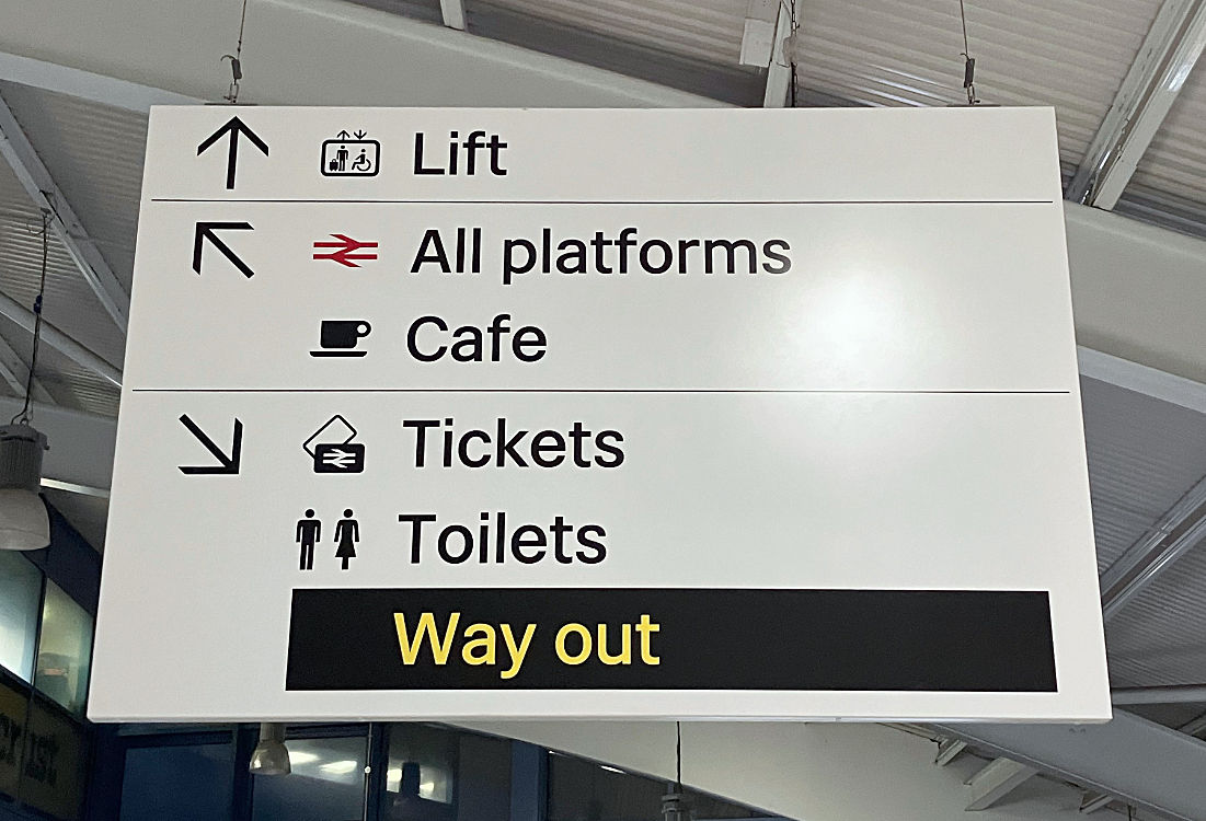
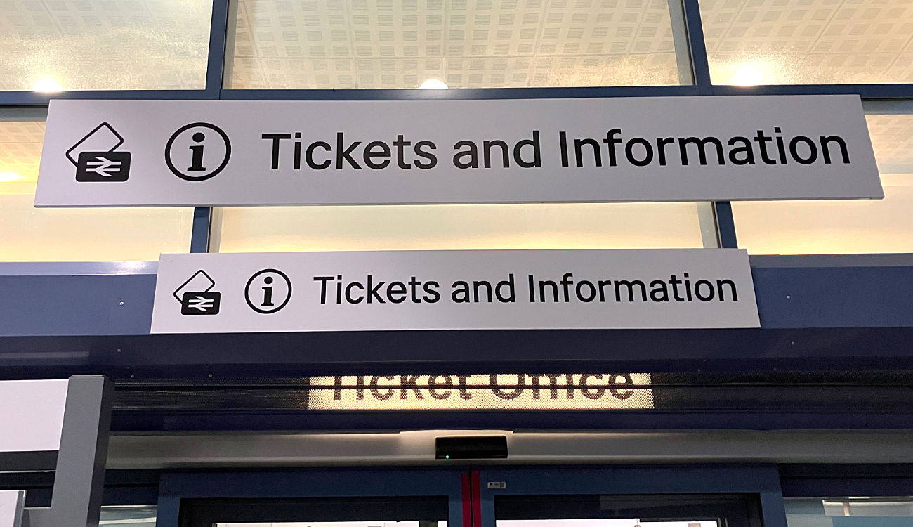
A random update to an old blog entry. The new Network Rail signage by Spaceagency and Kubel/Calvert as flagged here is being installed across the network with surprising rapidity, as the renationalisation of the railways proceeds. Bristol Parkway was done in 2023 but I’m always in too much of a hurry to snap the new stuff until now.


Margaret Calvert’s Rail Alphabet 2 comes up good with its outstanding clarity. The new sign formats improve on the sometimes cluttered British Rail plank system - our understanding has advanced in 60 years, even though the original was radical in 1965. We don’t need an arrow for every line, just group things in the same direction under one arrow - I think there’s a maximum number of four per arrow. In the second picture the offending non-standard Arial is still hiding underneath!
20.12.24 / 01 / a kind-faced christ
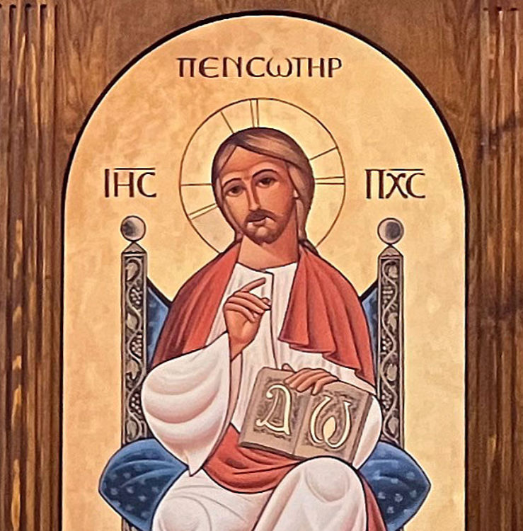
Back in July I was photographing churches in the City of London, including St Andrew by the Wardrobe. I found it open unexpectedly, so I was too busy getting my shots before somebody came and got in the way / threw me out, to pay much attention to the content of the icons. Later, reviewing my photos, I was surprised by the kind face of the Christ.

Ordinarily this ‘Christ enthroned’ image shows him as a stern majestic figure. In the Byzantine tradition icons tend to an imperial feel - these people are bigger, holier, sterner than we are. They don't smile. But the Coptic tradition is more humane, especially in its current neo-Coptic form - almost cartoon-like with its abstraction and big eyes. The big eyes are an authentic and very ancient Egyptian tradition - notably in the funerary portraits of Roman times which are a major root of Coptic iconography. One could almost call it naive, but I also think of the big-eyes tradition of manga. Which shades into kawaii - are these icons a little bit kawaii? Is that a bad thing?
The icons are by Fadi Mikhail, an Egyptian/English painter. He seems to be the current master of neo-Coptic art. His icons are quite a contrast to his personal Post-Impressionist work. His Essex accent is not what you’d expect! One feels that an iconographer should have a deep, grave voice with a Middle Eastern accent.
14.12.24 / 01 / advent
The New Testament starts with hope, like Star Wars [Episode IV A New Hope]. It tips us straight into Christmas, all babies and angels. The Herod thing seems like a momentary interruption of the wonder-filled narrative. The light has come into the world.
But for most of humanity the 400 years of silence between the Testaments was ongoing. No word from God, no angels, no star, no light. The only people of consequence who noticed that something had happened were the Magi, and their well-meaning attention nearly screwed the whole thing and cost many innocent lives. The silence wasn’t broken for another 30 years.
Maybe we should start The New Testament immediately after Malachi, with 400 years of empires and atrocities. Kester Brewin suggested that we should put blank pages into our Bibles, so that we feel the weight of the waiting and longing that one day there will be another prophet, or even a Messiah.
And when the thing does happen, let it be as a footnote to the continuing blank pages, just small print, very hard to read. Simeon and Anna had turned the blank pages of their lives to the end before the footnote was written on them.
And put in too the blank pages representing the missing years of Jesus’ life before his public ministry, the long years of other Herods and other Caesars.
Let us understand that Christ was born in a world like ours, where hope is hard to find and risky to express, and doesn’t get fulfilled for decades, and then only in an apparently disastrous way that seems to lead nowhere.
And even when the flame springs up again it will be centuries and many deaths before it becomes established history that can make out it was inevitable all along.
So the context of Advent is the dark night of the world. The light shines in the darkness, and doesn’t seem to make any difference. The word comes to the people, and the people don’t want to listen. But the light and the word will endure.

