Blog archive April 2013
<< February 2013 / May 2013 >>
30.04.13 / 02 / it was 20 years ago today
from http://info.cern.ch/
On 30 April 1993, CERN made the source code of WorldWideWeb available on a royalty-free basis; the software was free for anyone to use, and remains so today. Web usage exploded as people started setting up their own servers and websites. By late 1993 there were over 500 known web servers, and the WWW accounted for 1% of internet traffic, which seemed a lot in those days (the rest was remote access, e-mail and file transfer). Twenty years on, there are an estimated 630 million websites online.
and here's the first website, as it stood in early 1993.
interesting that the web was developed on a NeXT computer, Steve Jobs' baby when he wasn't at Apple. Apart from being the basis of Apple systems a decade later, it shows Jobs' design eye long before his collaboration with Jony Ive.
30.04.13 / 01 / crt
on saturday i took my crt tv to the recycling centre. i bought it cheap in the mid 00s knowing that it would be obsolete when they switched off the analogue transmissions in 2012. i could get a freeview box but i only watch tv on the computer anyhow. why have a big heavy screen just for one type of content? (that's the digital shift in one - the link between device and content broken.)
it was obviously the day for getting rid of analogue tvs. there were five at that moment on the bench. once the good ones would have been set aside for sale or repair, but now a man cut the power cords off without even looking and tossed them into a shipping container full of dead tvs.
so that's a major 20th century technology gone. 80 years or so of existence, 50 years of dominance. television isn't one thing anymore, isn't an object around which we must gather. so what is it, if it isn't defined by a particular technology or way of watching? it's the same question that music faces. for the moment we continue with albums, singles, series, channels, programming left over from old technological constraints, until we can agree new norms based on attention span and consumption mode.
are size of screen and length of viewing time the new key factors? are live broadcast and serialisation the essence of tv? if we plot all video media on those four axes, which part of the graph is 'television'? is the word itself obsolescent? a news bulletin will be a news bulletin, a crime series will be a crime series, a channel will be a channel, but they won't be a TV news bulletin or a TV crime series or a TV channel. the TV bit won't signify anything anymore.
08.04.13 / 01 / 1986 tube refurbishment article
after the last post i found this 1986 article about the 80s tube refurbishments in an old file of architectural magazine extracts. the writers' judgements have broadly stood the test of time, although the kings cross scheme, which they liked, has gone while piccadilly circus which they didn't like remains - for the moment. it has to be said that london transport's design standards wobbled in the 80s [see also here].
designers' journal was a good magazine - intially a monthly supplement to the architects' journal, then as a stand-alone. it closed in the early 90s recession which bit the building industry very hard. i had every copy of designers' journal, i kept a few and some extracts but i wish i'd kept more. i didn't know then that i would be working in that field 20 years later.
07.04.13 / 01 / in praise of wrong colours
in its 150 years of existence the tube has been through many eras of design, each of which has left its mark. each era has its own ideas about what constitutes a good public transport experience, and has its own repair and upgrade issues. the preceding untidy and outdated era is always being improved and swept away, but the job is never finished before economic and political circumstance intervene. so the glory of the underground as we have it is in its incoherence, its many layers of old fashion, a richness denied to those newer metros that only have consistency to offer.
at the moment we are in the middle of another clean-up campaign, tied into crossrail and the olympics. on the whole this has been a good thing. many formerly dingy stations now gleam. there is a kind of improvement kit which has a standard ceiling and lighting setup, the standard signage and station name systems, and white wall tiles with line-related accent colours. it's the wall treatment that worries me. it's fine in itself, and where the preceding treatment was irremediably filthy, ugly, or unsuitable. but i fear for the quirky or unfashionable parts of the system - those places that are ageing, out of date but not yet 'heritage'.
the 80s seem to have been most under attack lately. many central area stations had total makeovers in the mid 1980s, which were sorely needed at the time. major artists were commissioned to design the wall treatments. the designs made reference to their locations and were very different from one another, rather than providing a consistent tube-branded experience. this aspect was criticised at the time and ever since.
the current refurbishments have imposed the new uniform of white tiles, leaving only the more distinguished artwork elements - some have gone entirely, some survive only as a small representative patch. given the scale of works at tottenham court road i wonder how much will eventually be left of paolozzi's mosaics.
above: paolozzi mosaic detail
the fate of the 80s work shows the reversals of fashion well. its consistent background colour was beige tiling, not white. at the time white was considered cold and clinical. at embankment artist robyn denny created an interior of white stove enamel panels, with coloured stripes performing sequenced, abstract moves. at the time it seemed very dated, a hangover from the 60s by someone who hadn't moved on. now it seems timelessly modern, while the beige and brown is swept away.
above: 1980s beige and site-specific design
in fact, in the 60s the new background colour of the tube was not white, but two shades of grey. the blue/grey colour scheme of the victoria line was the height of early 60s modernist fashion [see also british rail]. it was said to be a neutral background, and that people would provide the colour. unfortunately financial restrictions led to poor lighting and a dingy effect. naturally these stations are in line for cheering up, not without good reason. but i hope that one or two can be preserved, like pimlico which is almost intact. clean it and improve the lighting. it has its own quiet elegance.
above: 1960s grey and bare fluorescent tubes
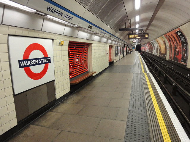
at warren street the grey tiles have just been replaced by cream, which is a throwback to 1950s stations like bethnal green. i have to say it's gorgeous, especially with black and red or orange.
above: 1960s grey replaced by 2010s neo-1950s cream. the 1960s maze artwork remains.
more of this would be good, but please leave a grey station or two, or the magnificently gloomy passageway at vauxhall where i used to wait for a train when leaving vaux.
above: 1960s dark grey and pale pink. it's the floor and ceiling that are bad.
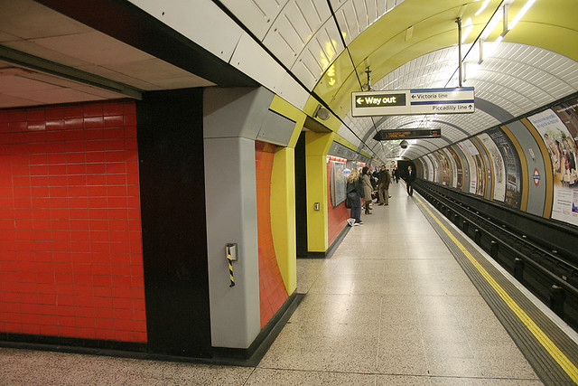
and then there are the intense late 70s jubilee line stations, whose colours inspired the first smallfire.org site and much else. the white tile wave seems to have passed and spared them for the moment, but i wonder what will happen when the fading yellow/grey/ochre laminate panels need replacing.
above: 1970s orange, yellow, grey and ochre
when i move through the tube i am constantly inspired by the strange juxtapositions and wrong colours - the combinations that once seemed good or normal, in their day. green and black, red and cream, orange and grey, beige and brown, yellow and purple. colours that show you how different the past was, or how different the future could be. combinations you wouldn't think of, inside the prison of your own time and taste. i hope that the people designing refurbishments have catholic tastes and historical awareness. i hope they have an eye for the distinctive and odd, not just for good taste and design classics. they could give me a job, of course.


