smallritual.org 16 2017
 |
 |
 |
 |
 |
 |
 |
 |
 |
 |
 |
 |
 |
 |
 |
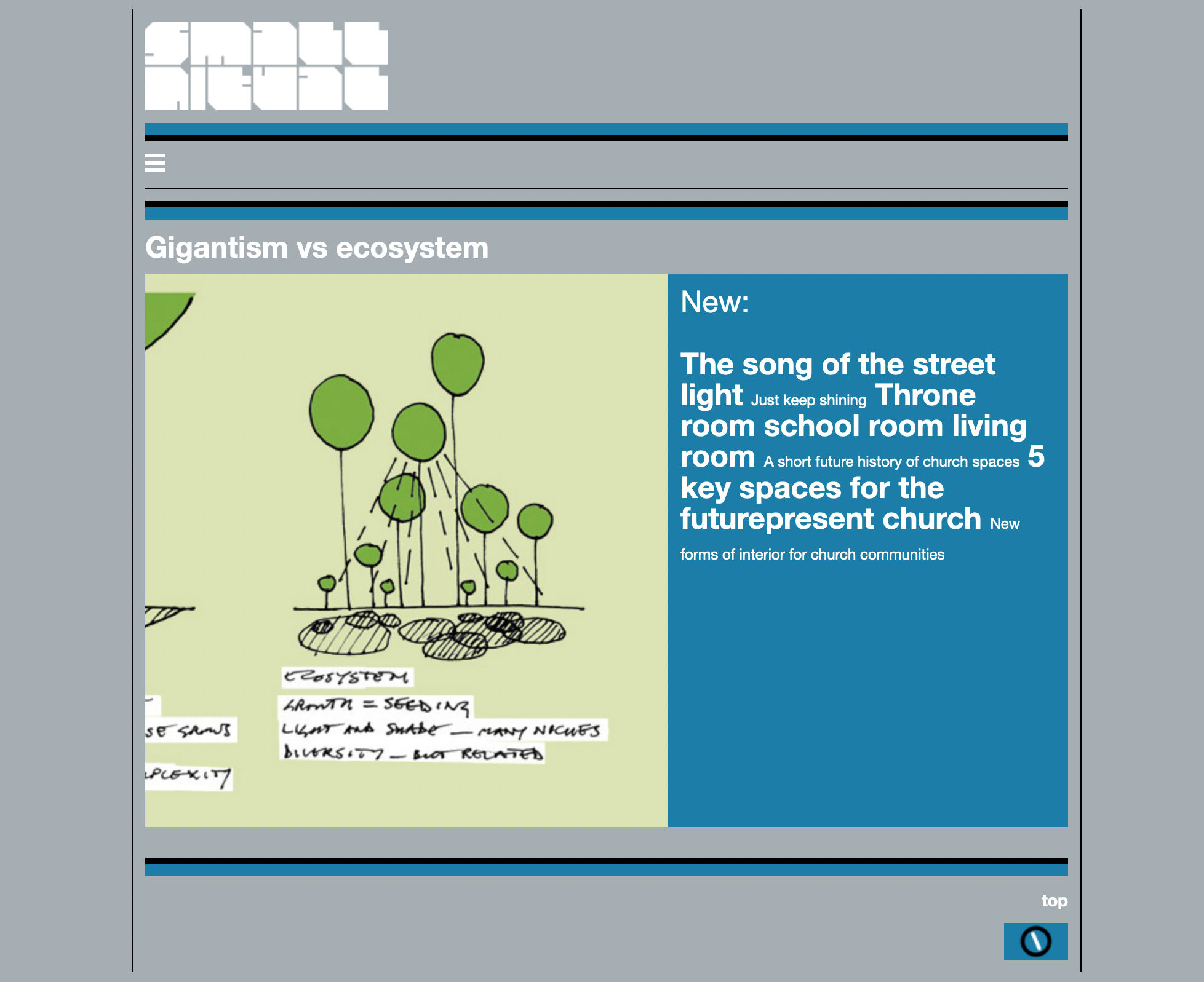
The 'liquorice allsorts' design. My early experiments with responsive layouts were very blocky, this was by far the best - smallritual 15 with the main menu moved to the top, and put in a drawer to take up less space. |
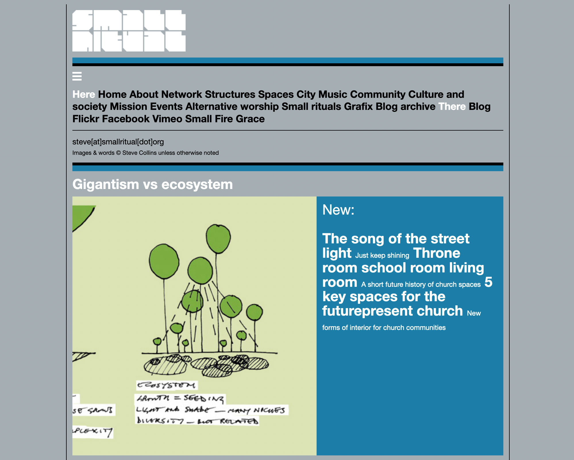
The main menu drawer open. The 'New' menu block in the image scroll was something I discarded. |
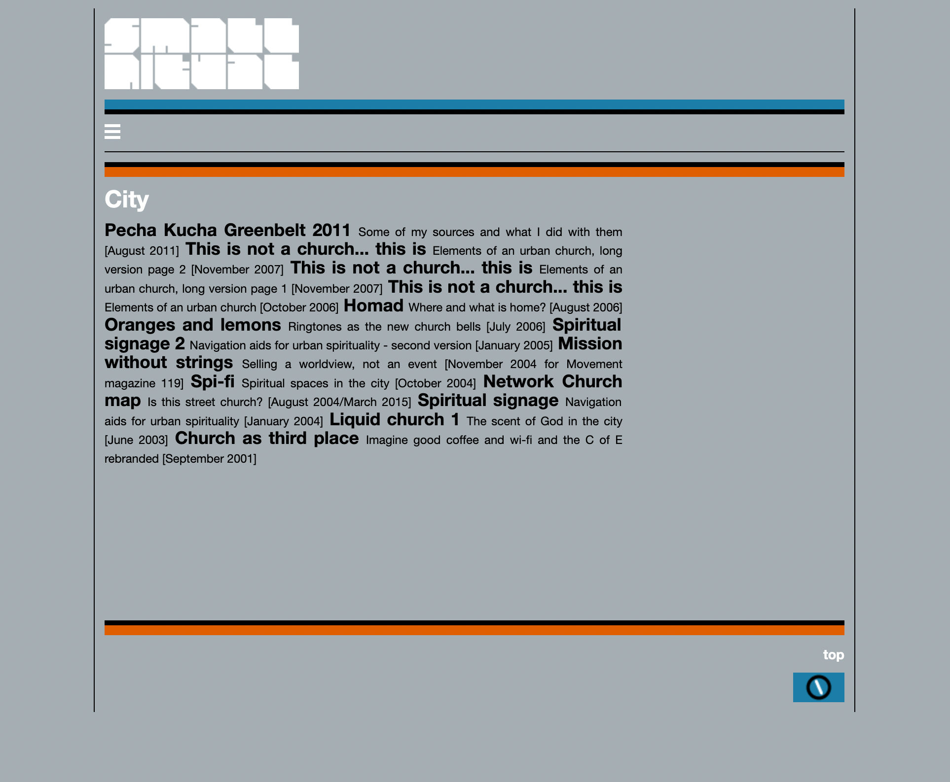
Section menu page. |
Section menu page. Different colours for different sections. The content pages couldn't be themed by colour as they appear in several sections. |
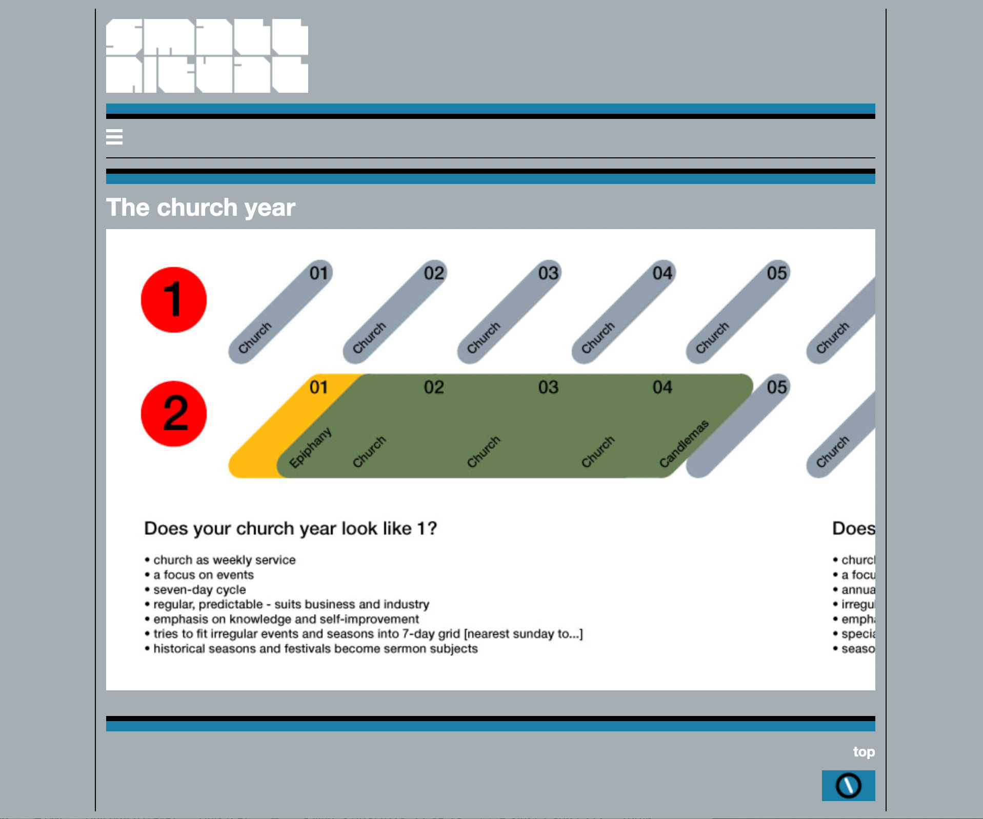
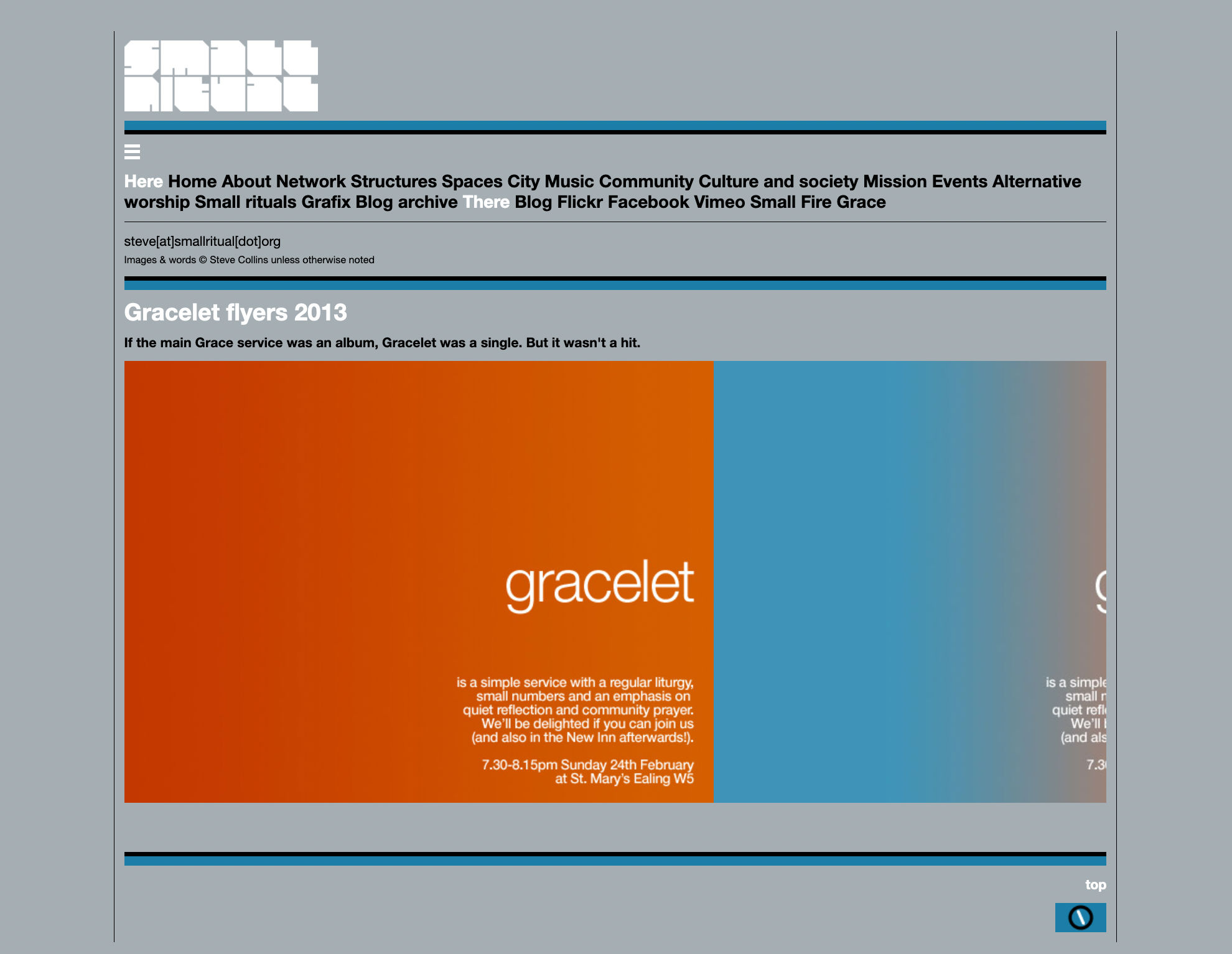
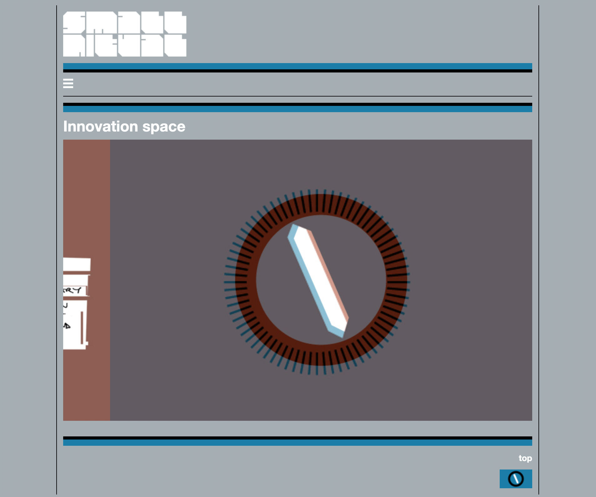
Image page. Horizontal scroll in a window between the tramlines rather than extending them as previously. |
Everything is contained between the tramlines, but the overall width varies to suit screen size. |
To avoid awkward residual space to the right of a single image, a secondary compass graphic was added. The colours varied to suit. |
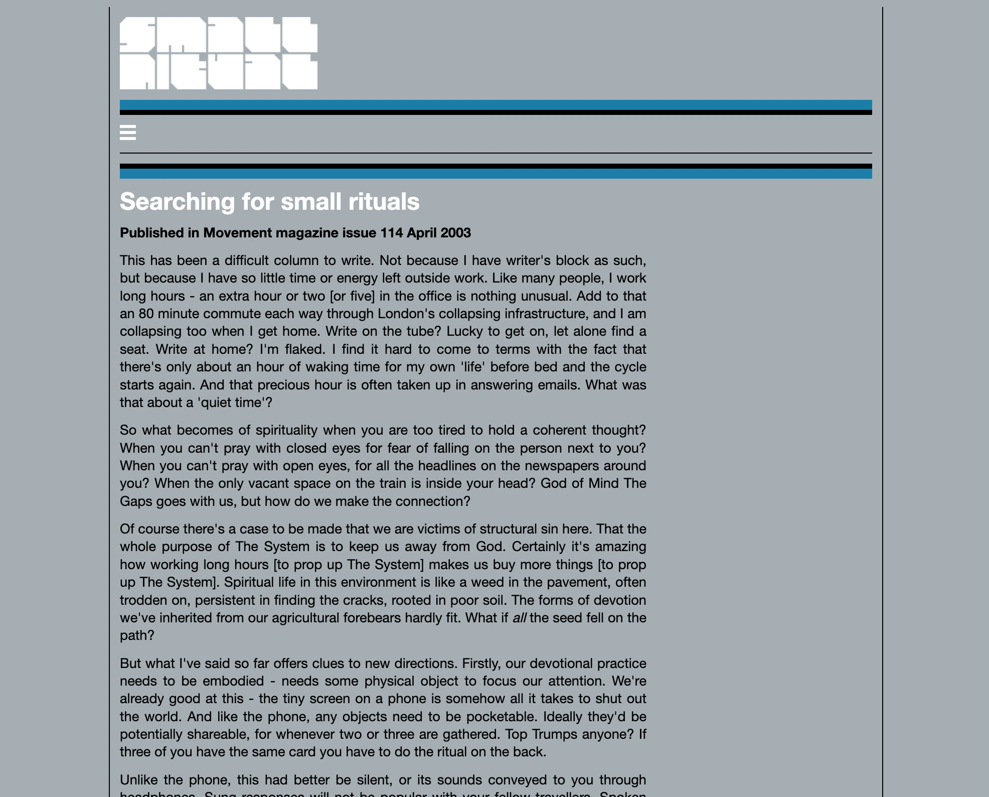
Typical text page, extending downwards between the tramlines for conventional scrolling. |
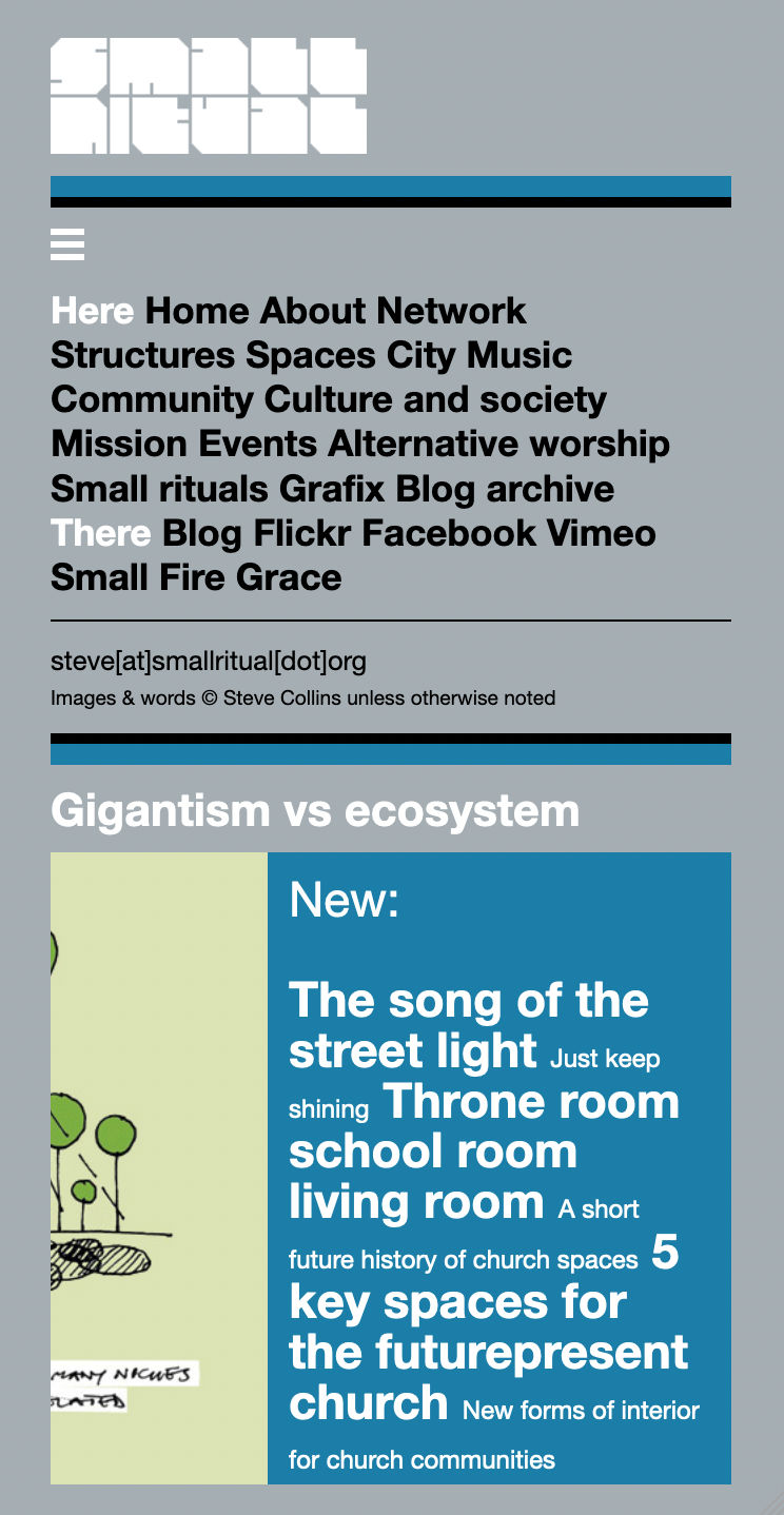
Phone format home page. No tramlines at this width. |
Phone format home page. |
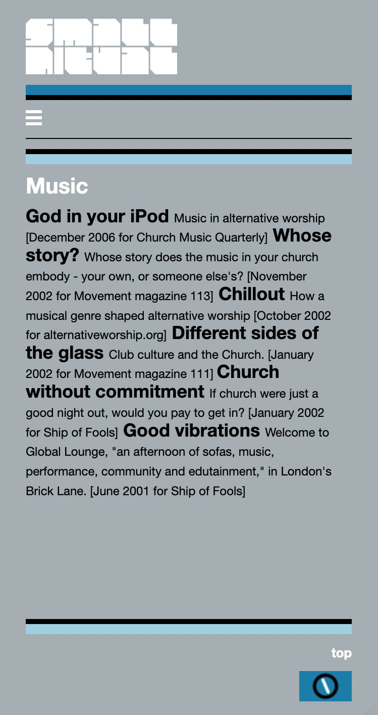
Phone format section menu. |
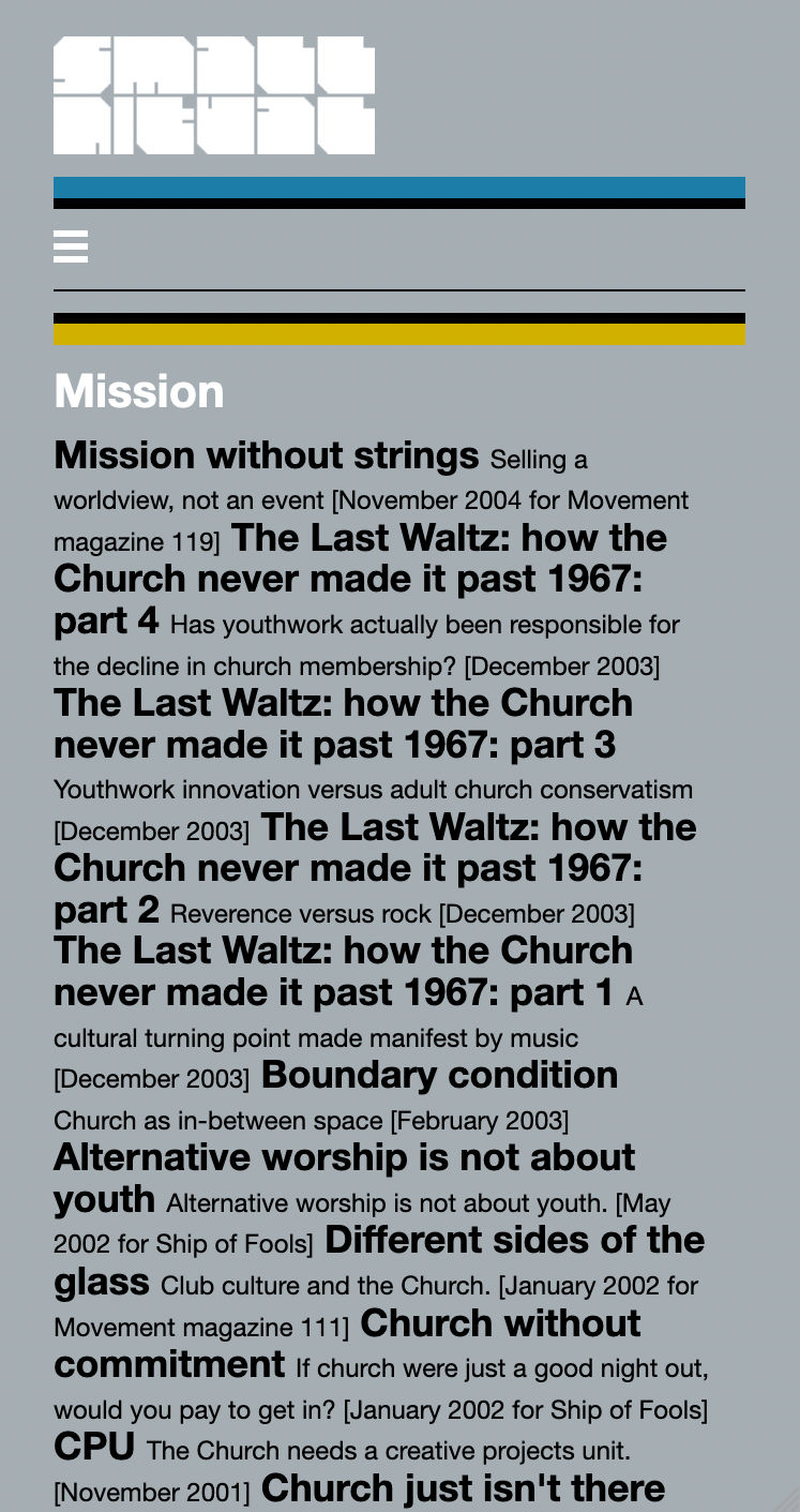
Phone format long section menu. |
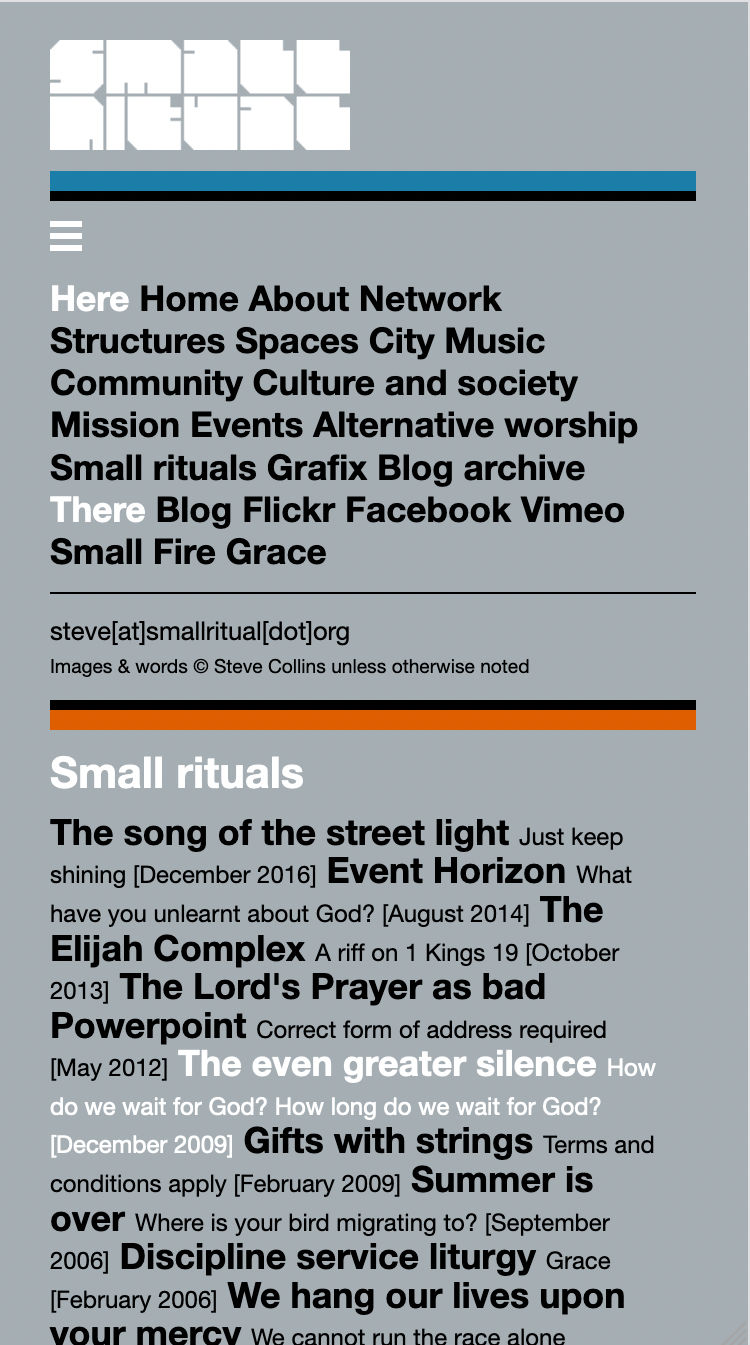
Phone format main menu open. |
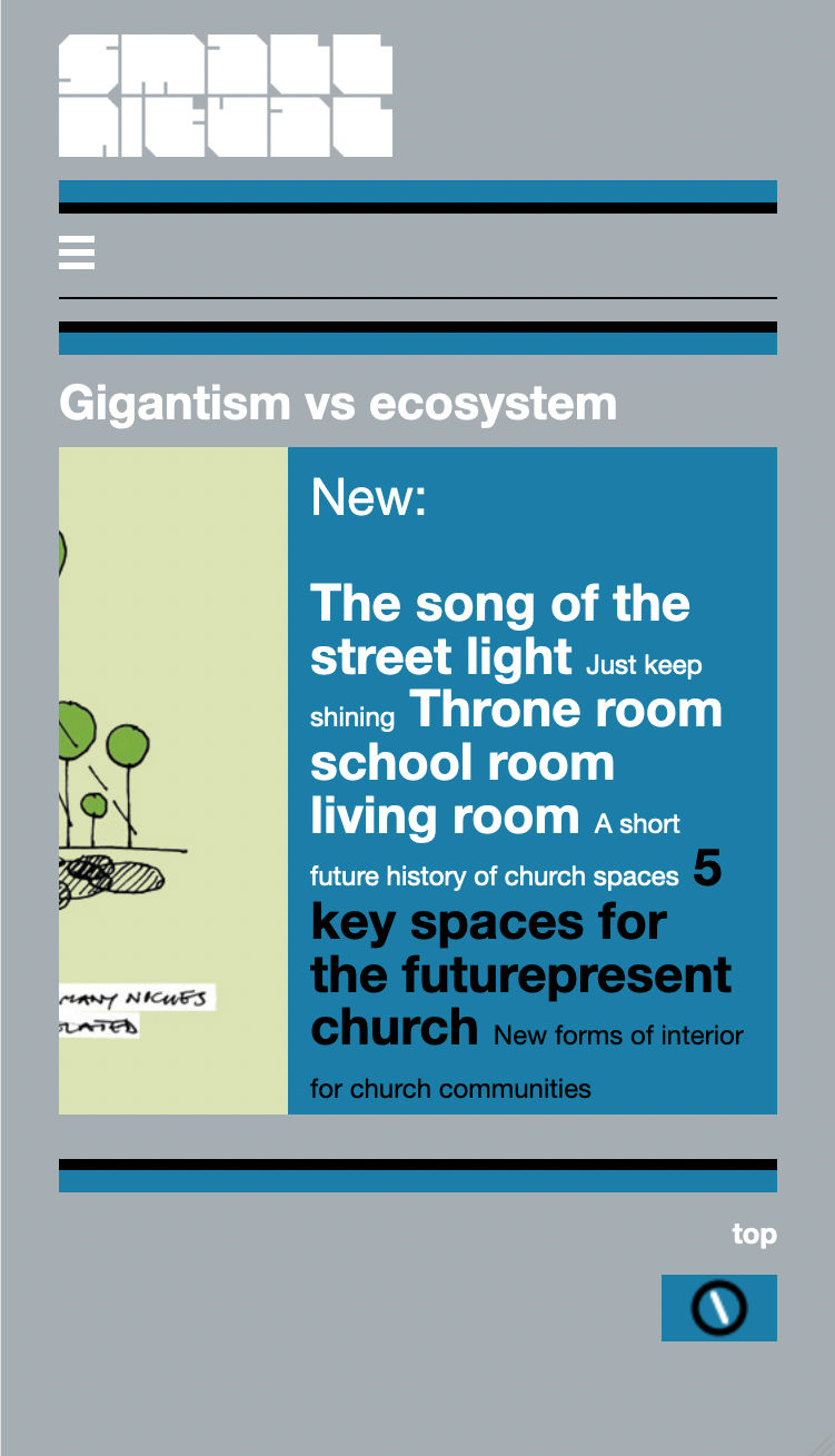
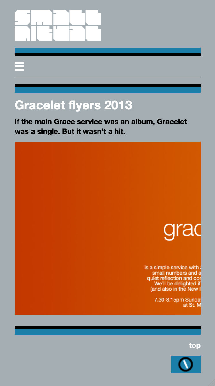
Phone format image page. The image scrolls horizontally inside the window. |
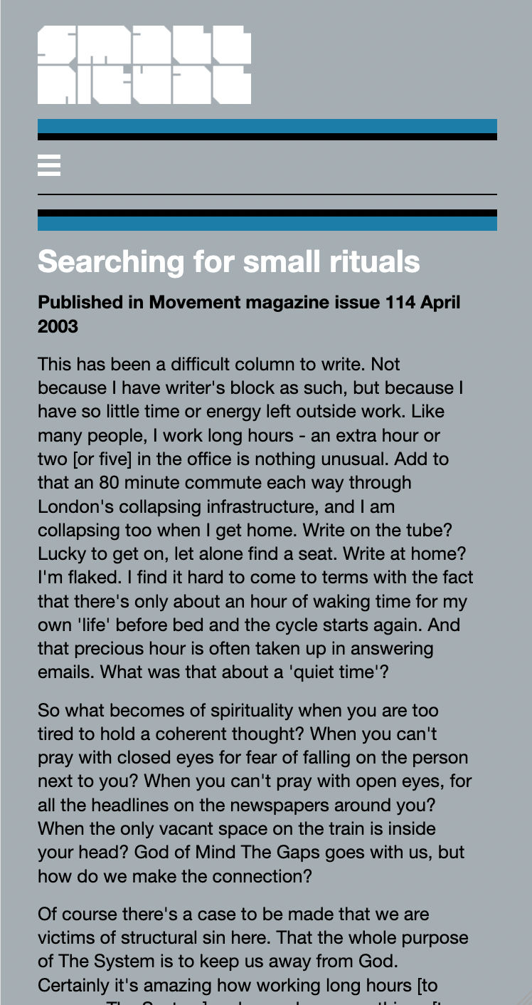
Phone format text page. |

