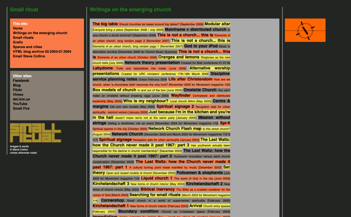
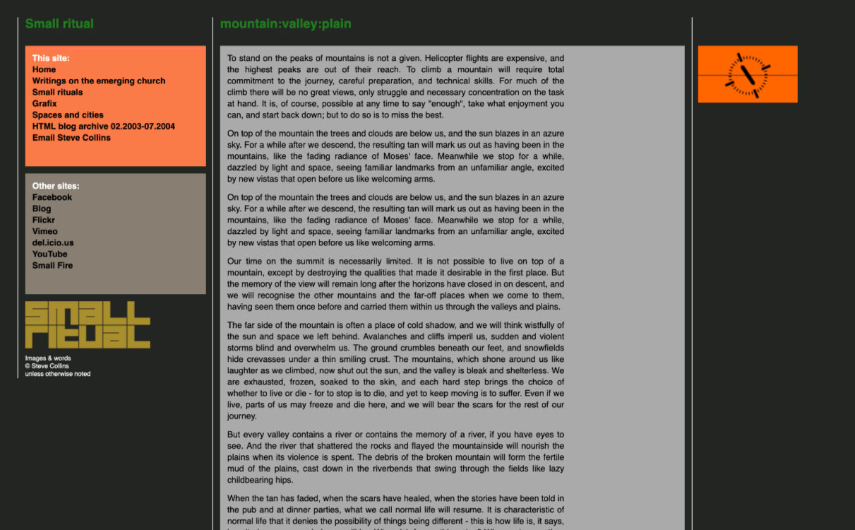
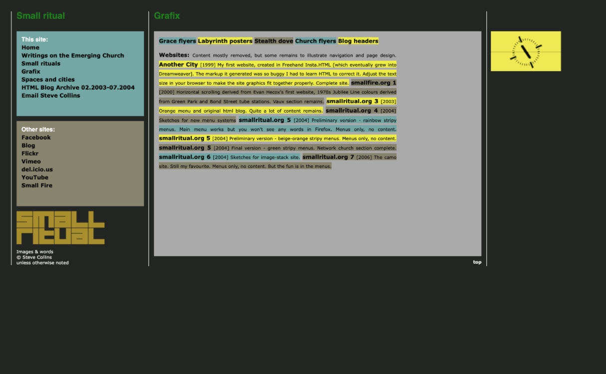
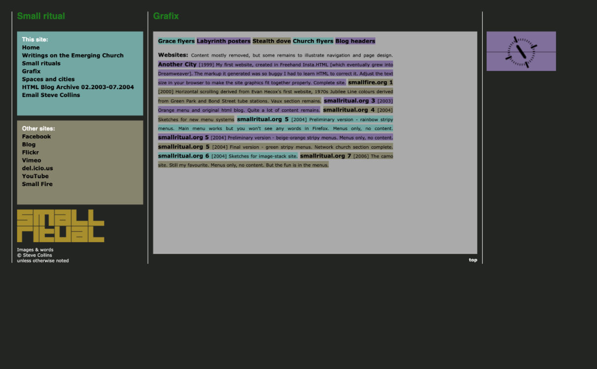
smallritual.org 10 darkmode 2010
 |
 |
 |
 |
 |
 |
 |
 |
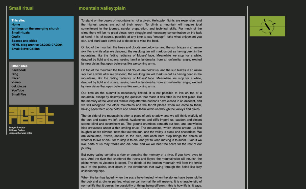 |
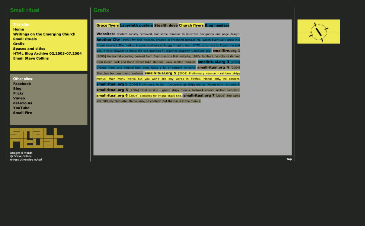
Inspiration from Braun products. A site shape more like the Braun toaster. A new menu structure, Helvetica text. These preliminary versions had a dark background, but I changed it to white at the last moment. |
Now that most screens were much wider the site design expanded to use the space, while still rooted in the top left corner for those on smaller screens. |
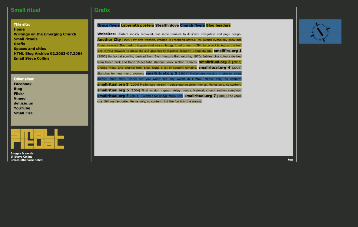
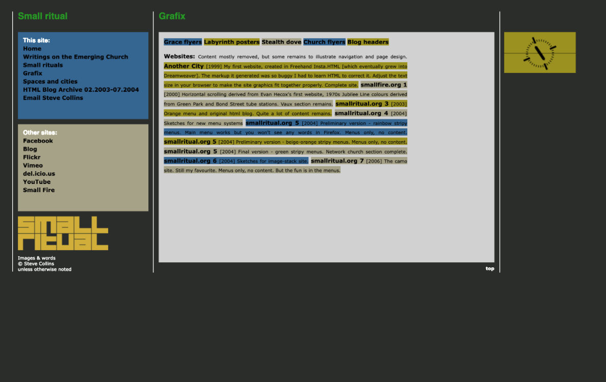
Trying out some softer colours. |
|
|
|
|
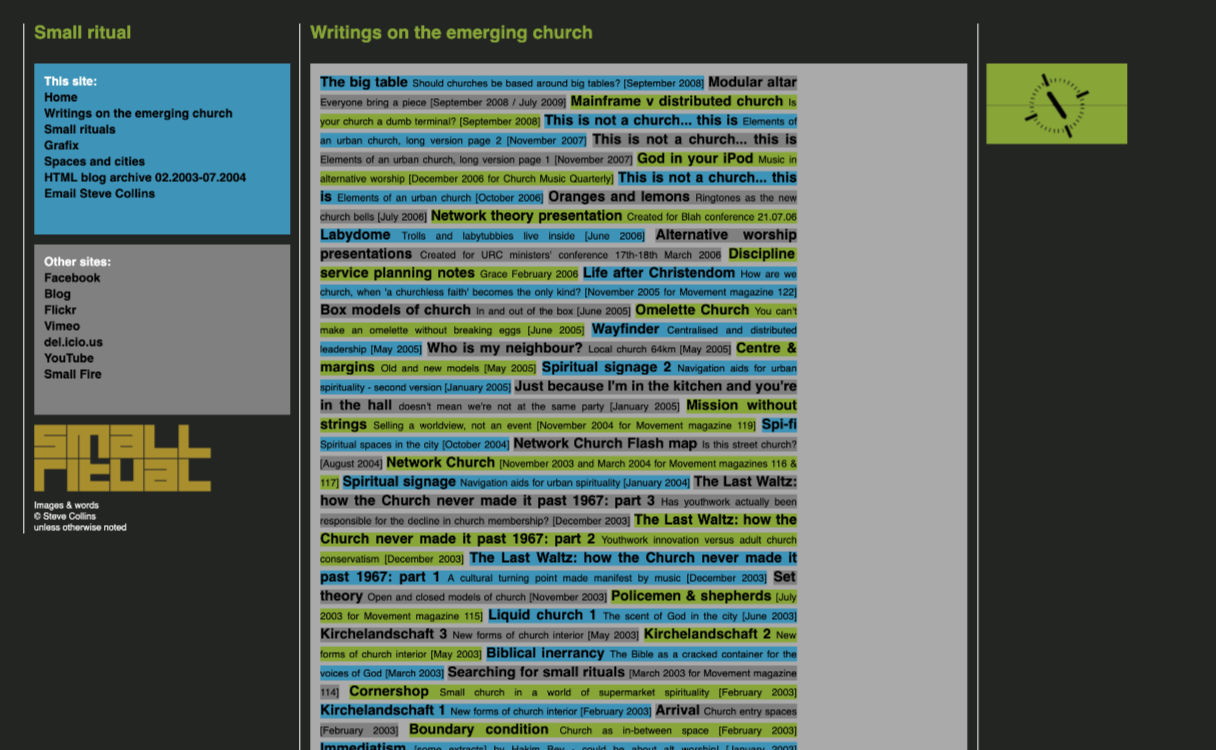
The final 2010 colours, but still the old logo. |
And then I thought, try it with a white background... |
