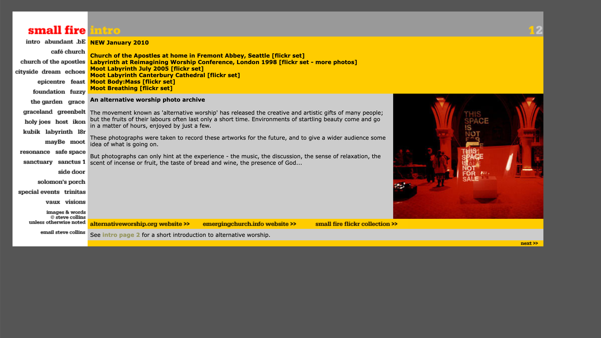
smallfire.org 6 2007
 |
 |
 |
Wider format as screens get larger. Main menu as 'text flow' (done with images) since there are now too many sections to put one below another. |
Section page with preview thumbnails. Multiple section pages rather than putting all the thumbnails on one scrolling page. |
Photo page, horizontal scroll format. The images were now larger as connection speeds improved. |

