smallritual.org 10 2010
 |
 |
 |
 |
The site was designed with a dark background, but changed to white at the last moment and given a new logo. |
Now that most screens were much wider the site design expanded to use the space, while still rooted in the top left corner for those on smaller screens. |
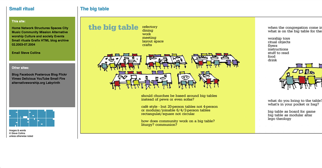
As before the site could extend downwards between the tramlines for conventional scrolling. |
Or it could extend horizontally for the image scrolls. The right hand tramline and the compass flag move rightwards. |